
FoxLife Rebrand
CONCEPT, CREATIVE DIRECTION, ART DIRECTION, DESIGN, ANIMATION, ORIGINAL MUSIC & SOUND DESIGN, OFF-AIR TEMPLATES, GUIDELINES
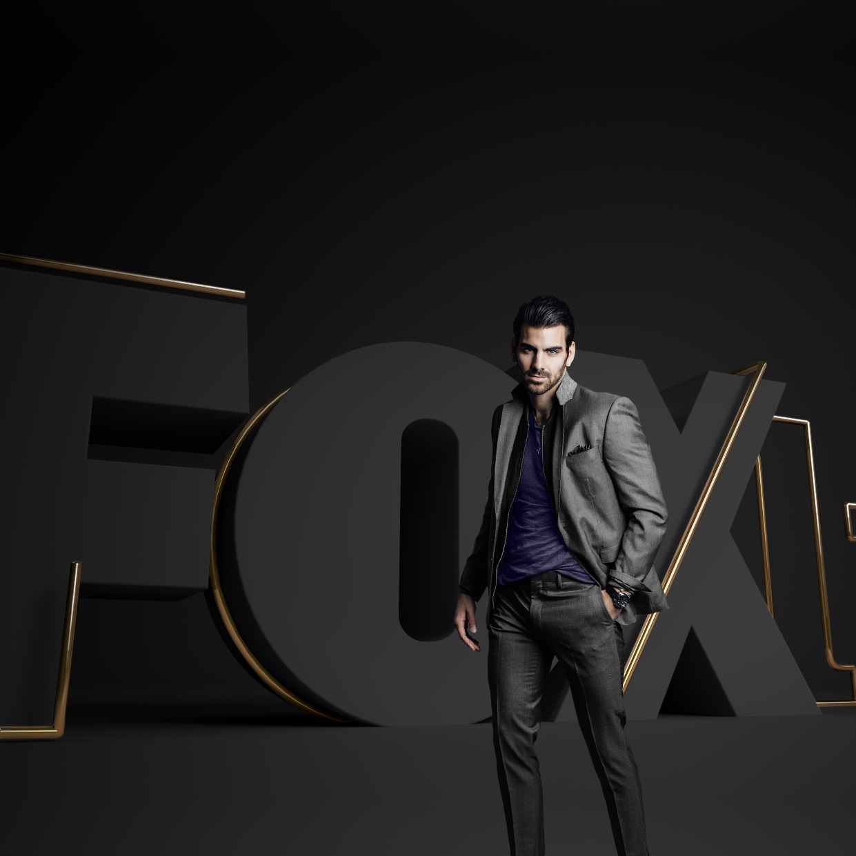
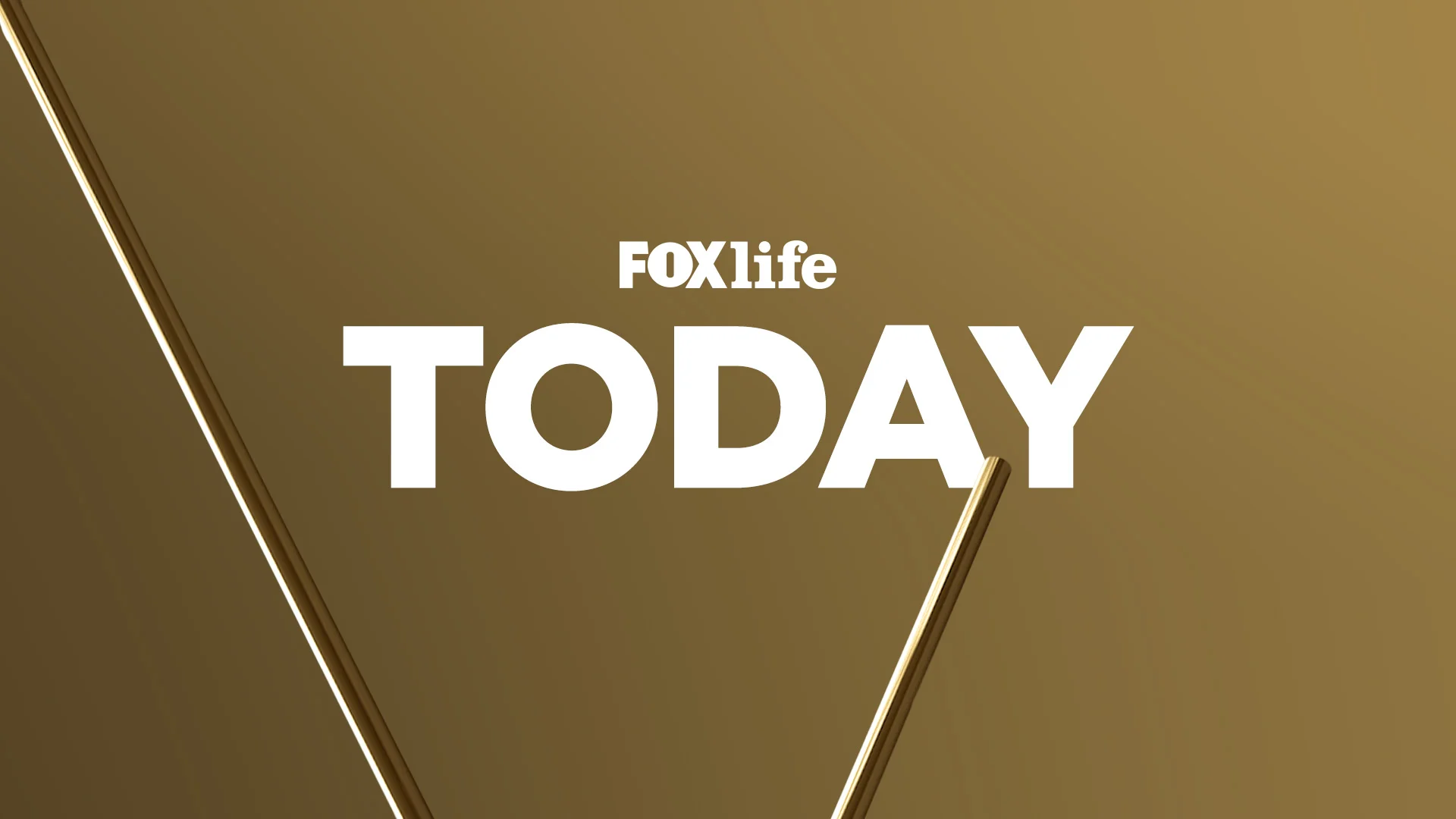
The goal of this rebrand was to give FoxLife a new visual identity aligned with Fox key visual attributes: the logo as hero, the big event tv feel, and the connection between the brand and the content.
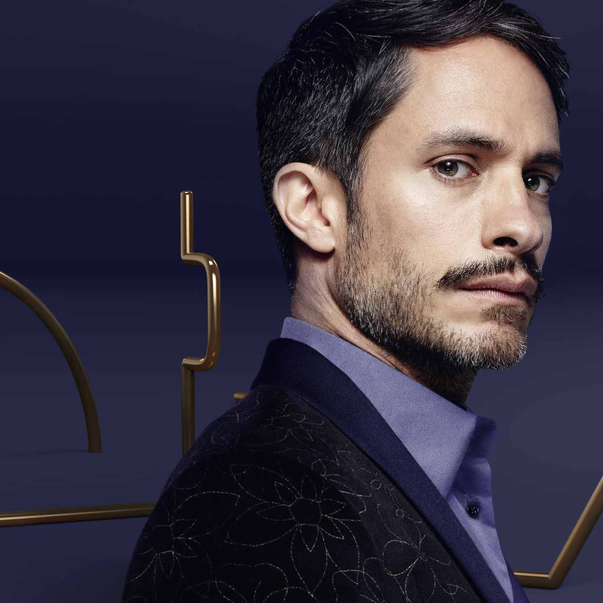
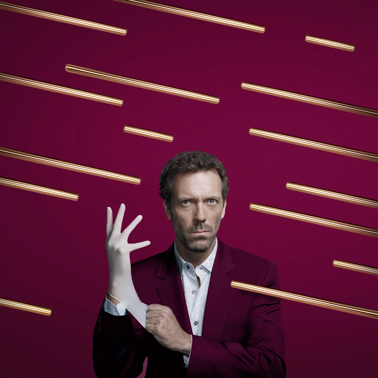
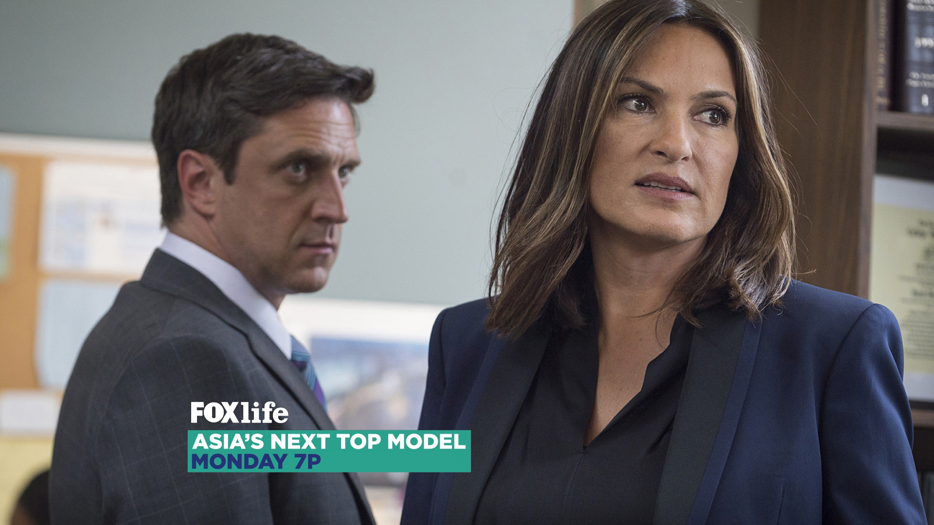
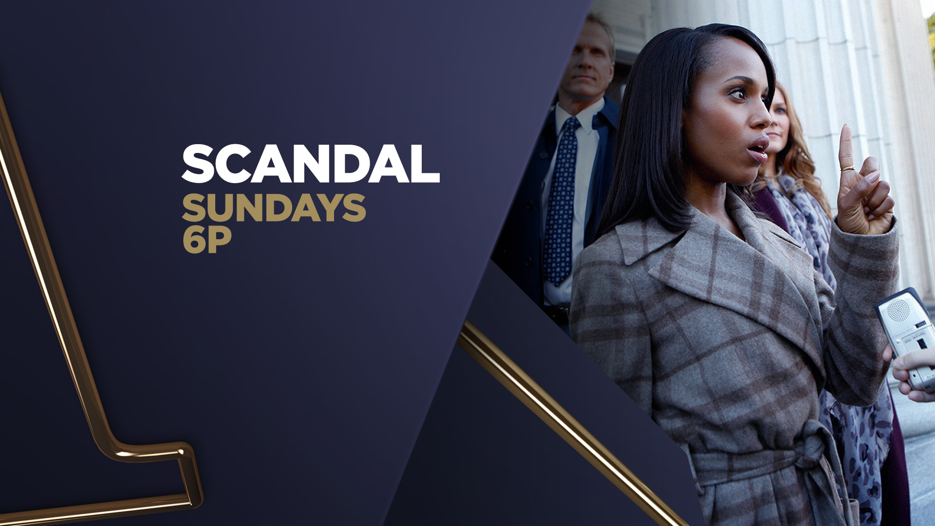
To reinforce the brand awareness, FoxLife identity was created having its logo as the key element, using it as a starting point for every composition. The logo letters generate volumes and spaces, a landscape where the show’s characters interact – integrating the shows’ content into FoxLife branding.
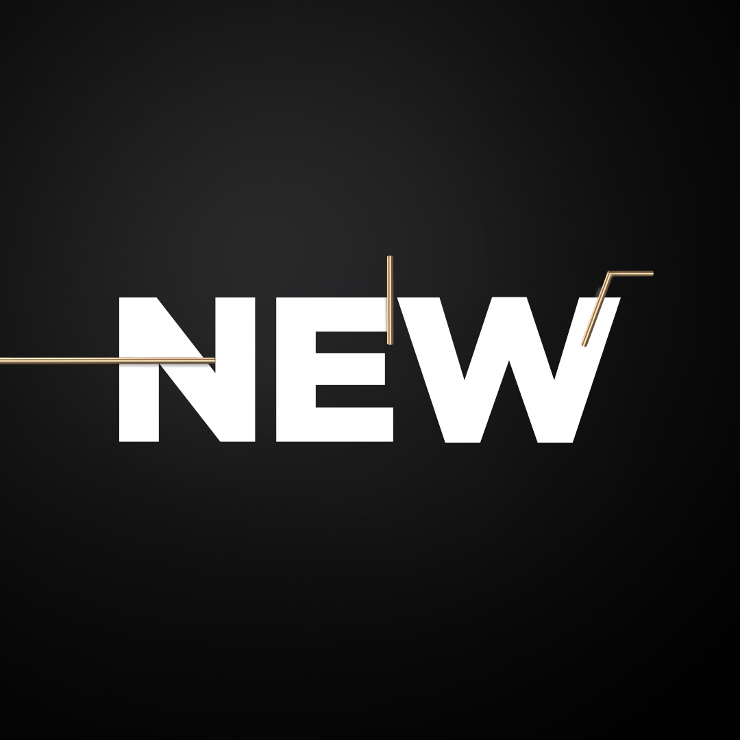
The uniqueness of this graphic package is created by the contrast between the chunky volumes and the feminine touch of a thin metallic line.
This line is used in many different ways: highlighting the logo, building the word “life”, creating patterns and shapes, embracing and supporting the characters…
The slim line glides smoothly through the heavy volumes, providing contrast and serving as an accent. It has different colors, material, and animation logic than the volumes, and both elements work together to create a sophisticated, modern and light feel.