Slice Rebrand
CONCEPT, CREATIVE DIRECTION, ART DIRECTION, DESIGN, ANIMATION
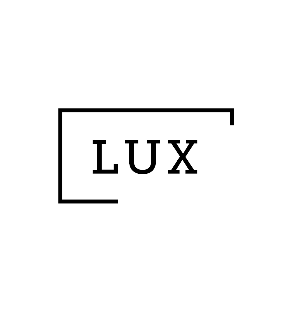
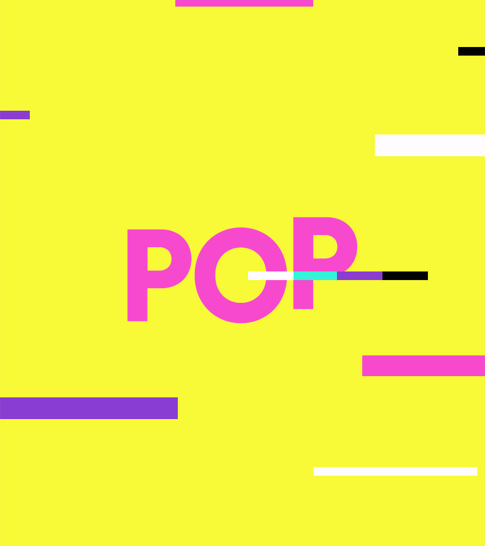
Slice presents throughout its programming the opposite worlds of Lux and Pop, Taste and Trash.
For their new rebrand, we developed a graphic system based on “The Beam”.
A graphic device thats breaks out from the logo and acts like a laser beam. Bringing “Pop” to “Lux”, color to black and white, fun to impeccable, chaos to taste, freshness to opulence.
Blasting through picture perfect pictures of luxurious lives. Slicing and dicing typography. Shooting through images. Cutting a path through all it touches. Drawing us into the comfortable worlds of our favorite stars, and then exploding them with drama and comedy.
Besides introducing this energetic chaos and movement, the Beam is also a way to organize information: as an underline, as an outline, framing and highlighting, and always linking back to the logo.
For the color palette we chose super bright, laser-like colors representing Pop, complemented with a gradation of grays, from white to black, to represents Lux.
And while a sans-serif type plays the part of “Pop”, the slabs on the “Lux” serif type organically connect with the beams...