Mega Rebrand
CONCEPT, CREATIVE DIRECTION, ART DIRECTION, DESIGN, ANIMATION, ORIGINAL MUSIC & SOUND DESIGN
It was an honor and a pleasure for us to work on the Rebrand of Mega, Chile’s number 1 free-to-air tv channel.
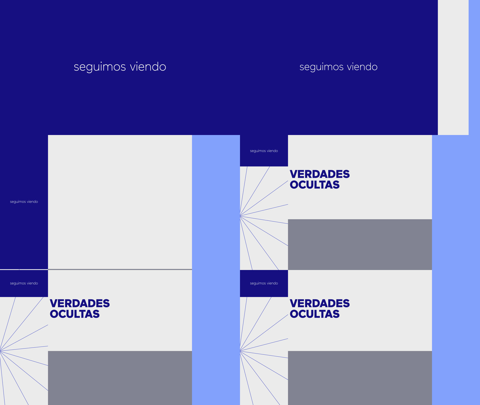
We developed this rebrand based on the concept of multi-screen: television is no longer consumed only on the big tv screen, but on every available display: phones, tablets, computers, even watches — perhaps also glasses in the near future?
We decided to represent these different sized devices by populating the screen with various smaller subdivisions or modules, using them as containers for footage, as backgrounds for texts, to organize information establishing size and color hierarchies, and to frame the logo.
This modular system provides an incredible amount of flexibility and variation. Based on just a few basic elements, their different combinations result in countless possible configurations, which allows the network to avoid repetition and bring in a lot of diversity, while at the same time keeping a clear identity.
Coming from a previous multicolored and all too playful graphics package, one of the goals was to tone it down, to make the channel more sober, serious and mature.
The minimal branding and a color palette of blues and neutrals are aligned with the shift in focus from the lighter and easier shows to the more meaningful and deep content.
In a process that started in 2019, aired in 2020, and we kept developing further in 2021, this rebrand aims to work in a fluid, upgradable, ever-evolving way.
Not just as a traditional toolkit with a static set of deliverables, but as a living system. One with the capacity of generating endless different pieces, all of them sharing the same Mega DNA.


