ViacomCBS Consumer Products
Design exploration
📍USA
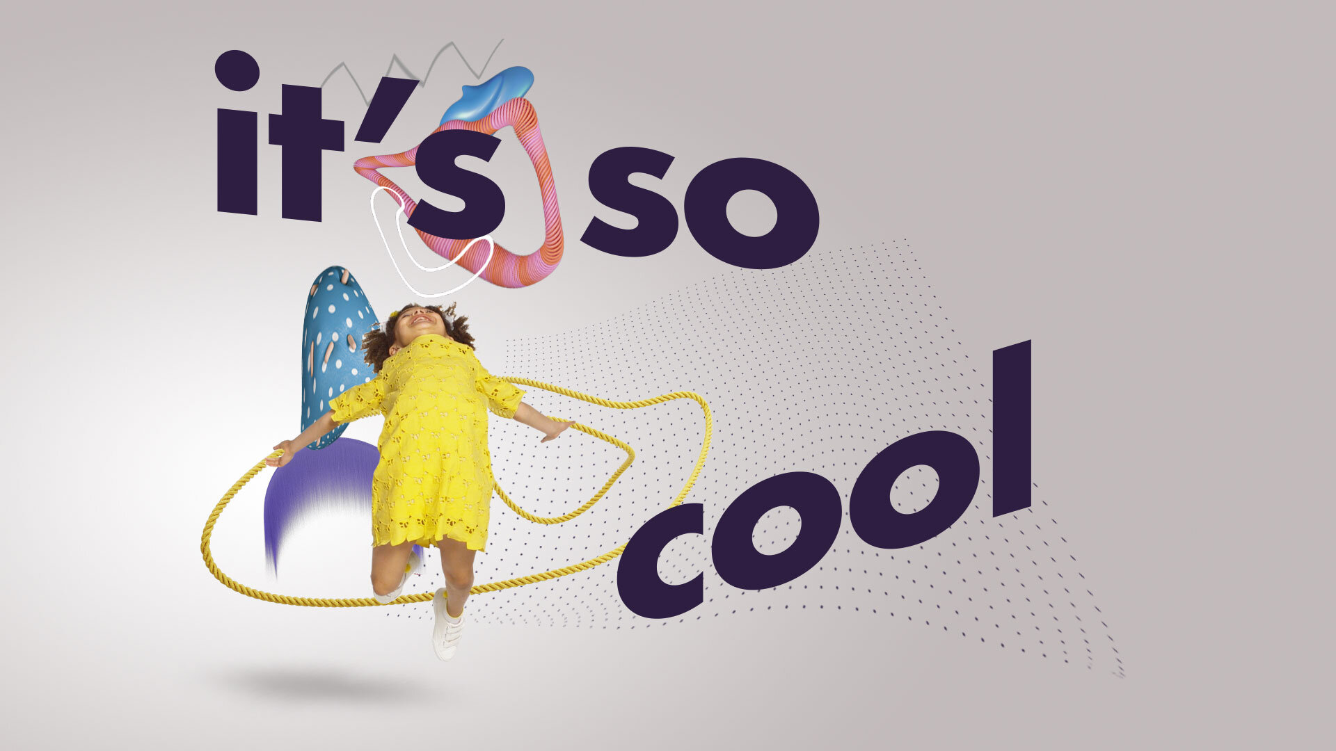
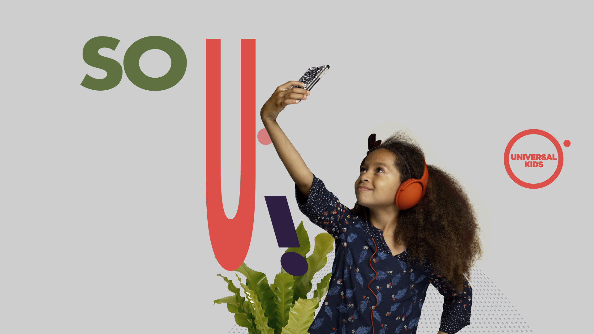
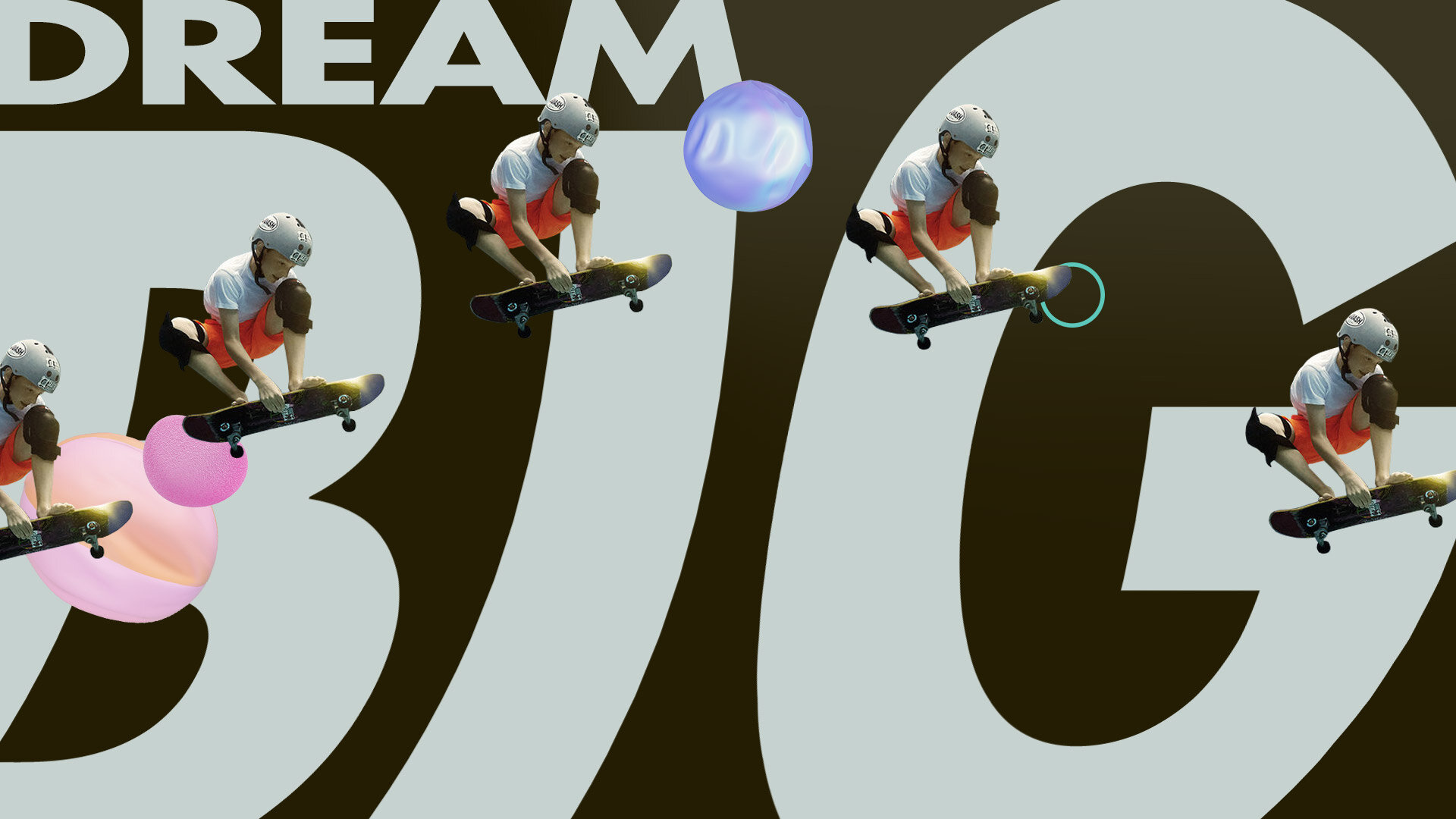
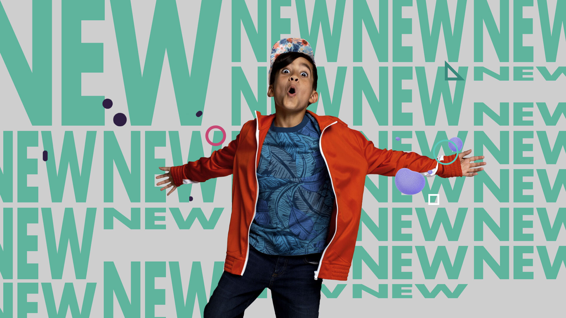
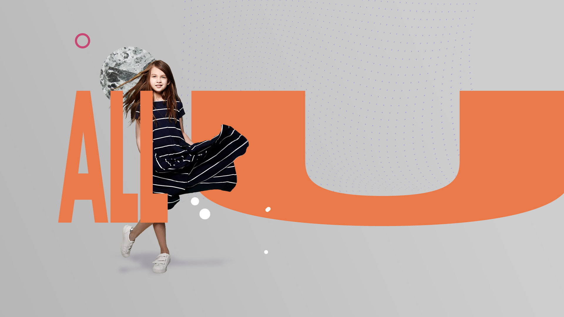
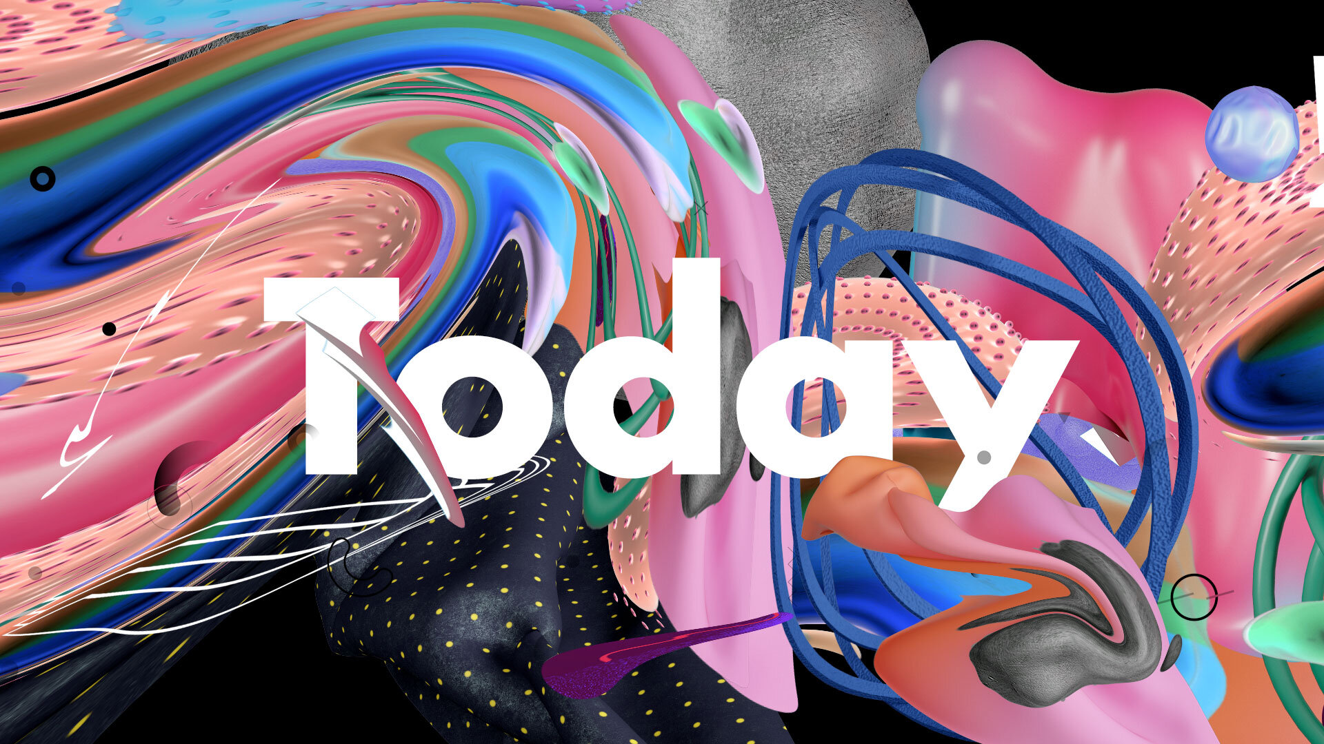
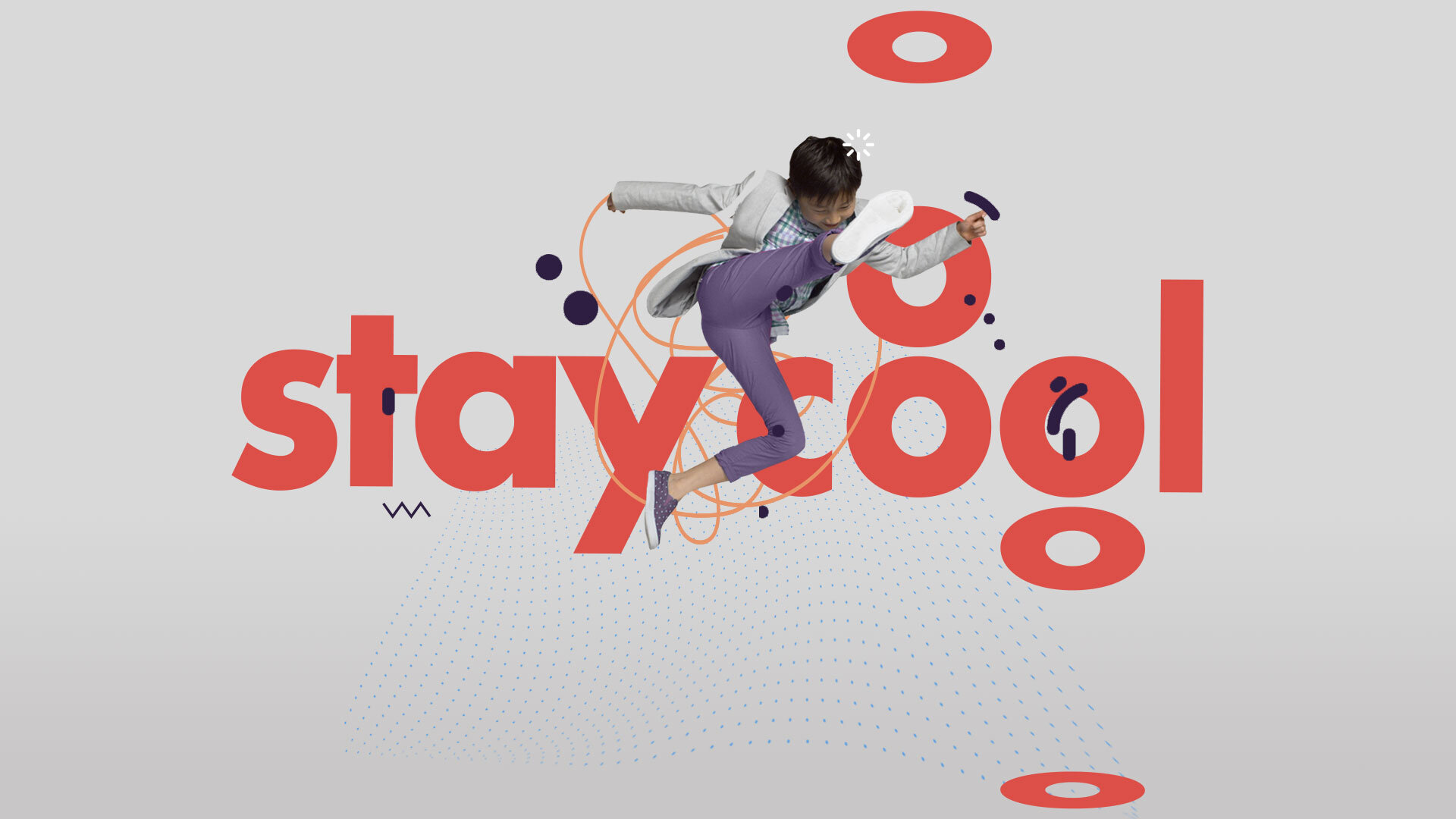
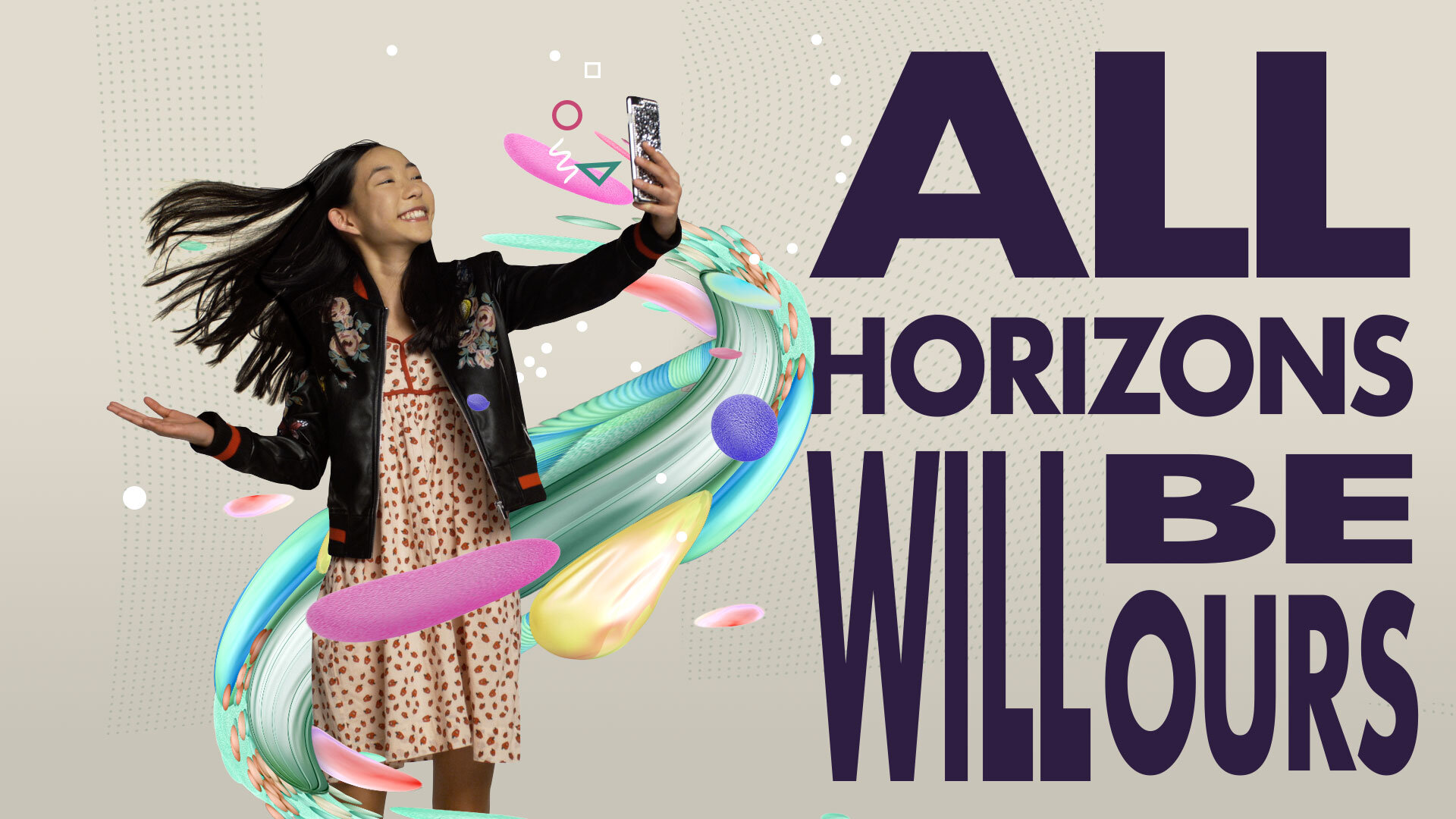
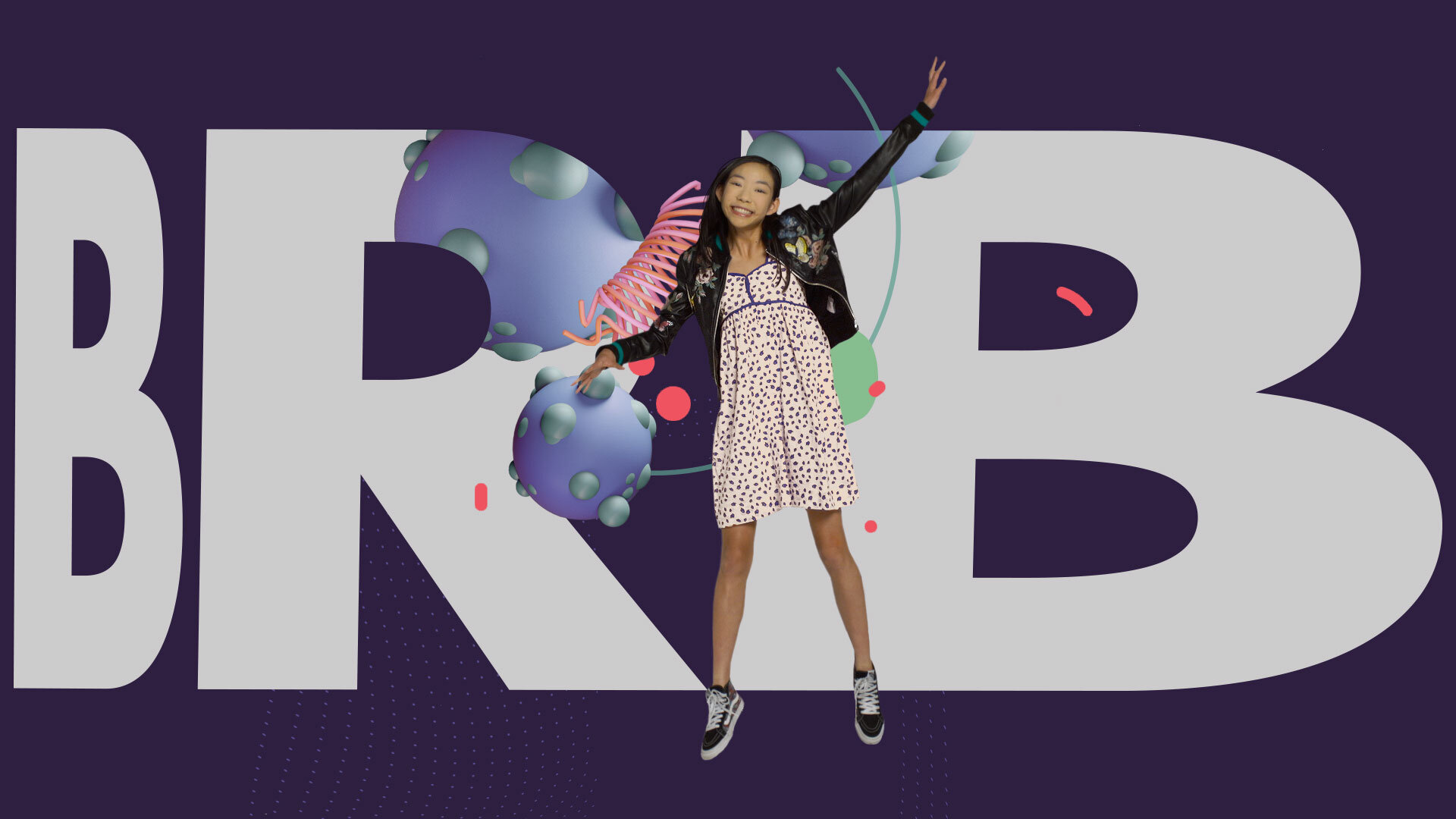
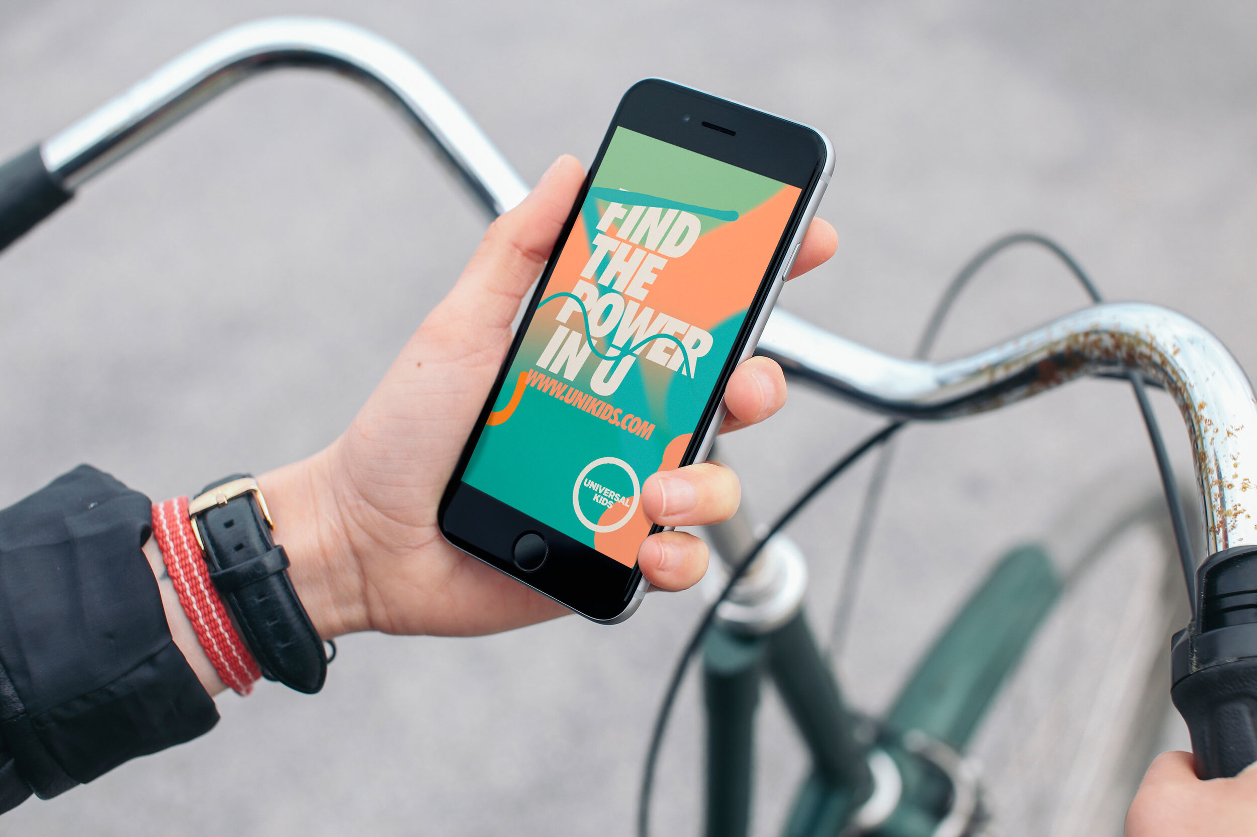
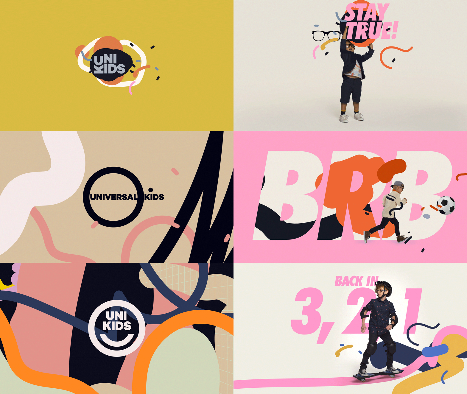
A modular approach designed to provide lots of flexibility to display a big variety of products and properties in a scalable, adaptable, easy to use system.
A design language that needed to be able to go from the smallest to the largest sizes, used in digital and print, and both from far away and up close.
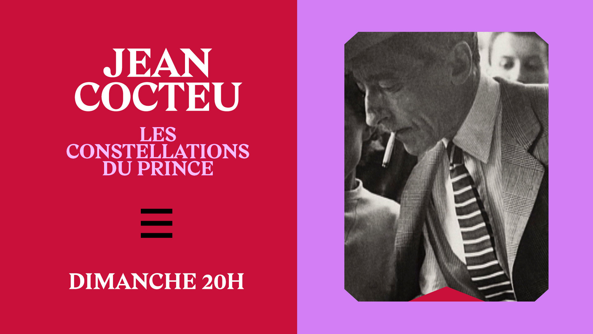
Histoire TV
Rebrand Pitch
📍 France
Classique Modern — Modern Classic
History is looking at the past, but from the present moment. As much as it is fueled and sourced from past events, it is deeply shaped and informed by present interpretations.
History is not archeology. It’s not about uncovering the old and forgotten. It’s about giving meaning today to what happened in the past. It’s about making it understandable and relatable for the present times.
It’s about bringing past and present together. Merging the old and the new. Classic and modern. Past and present. Sources and interpretations. History and stories.
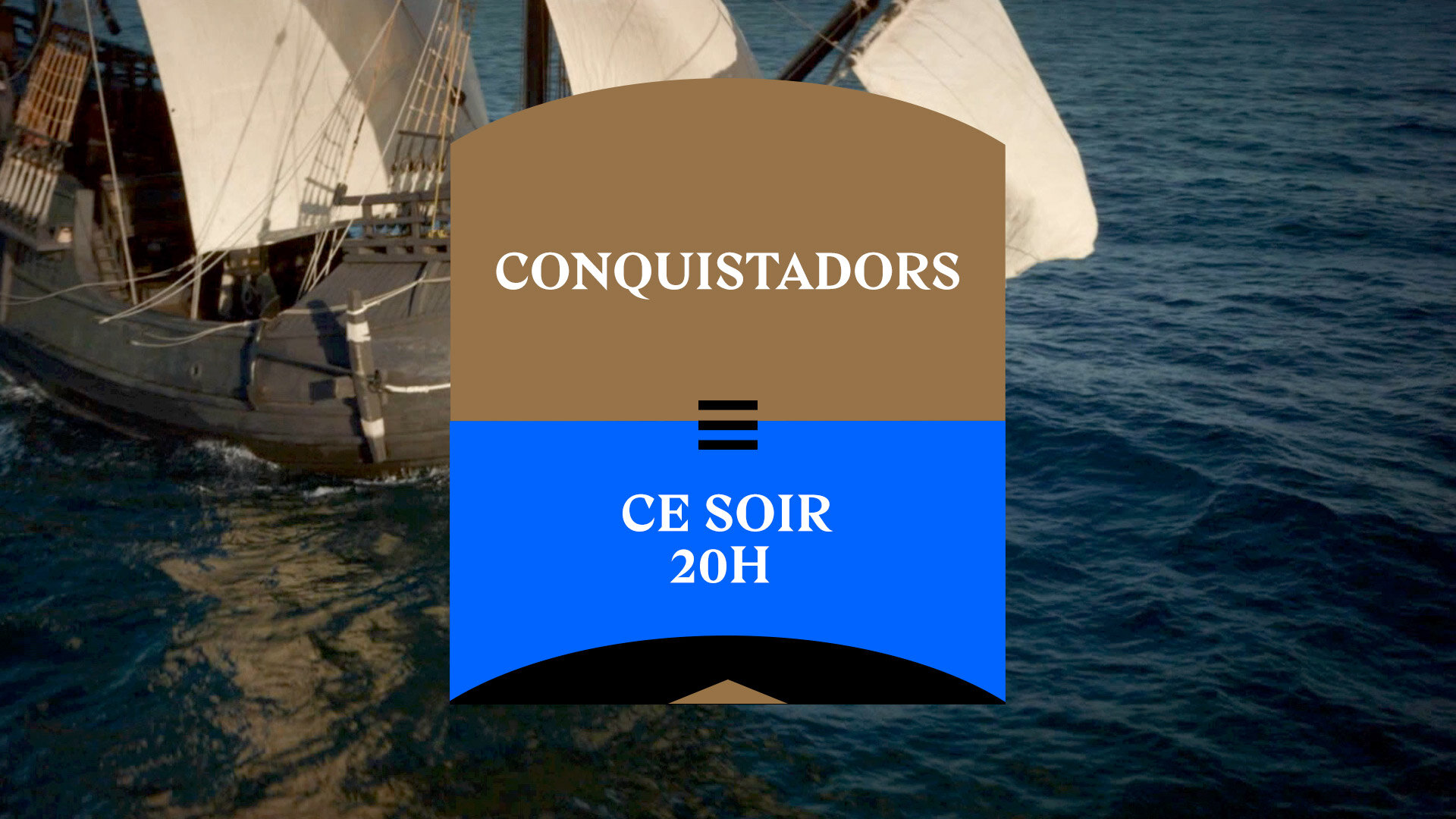
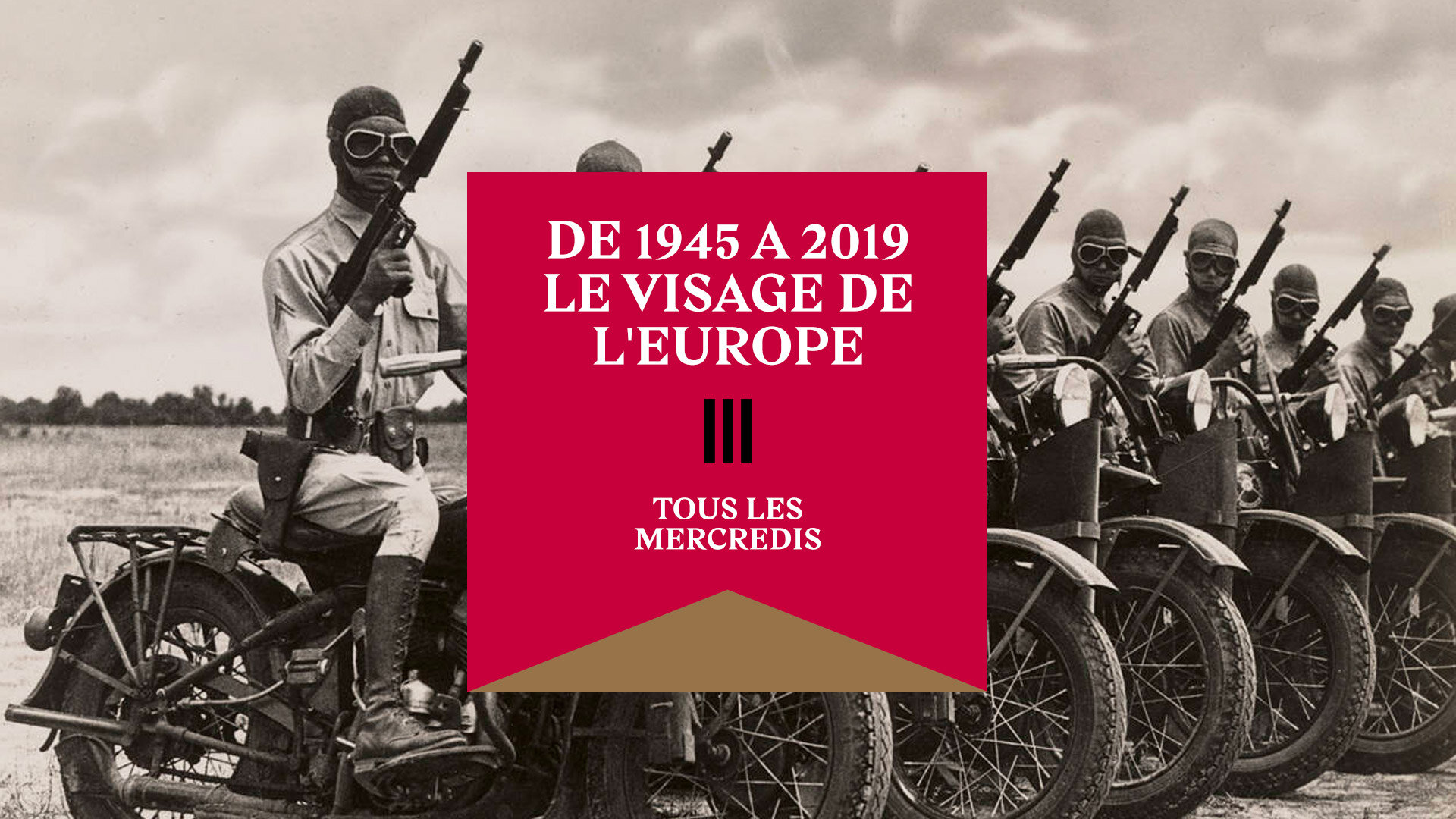
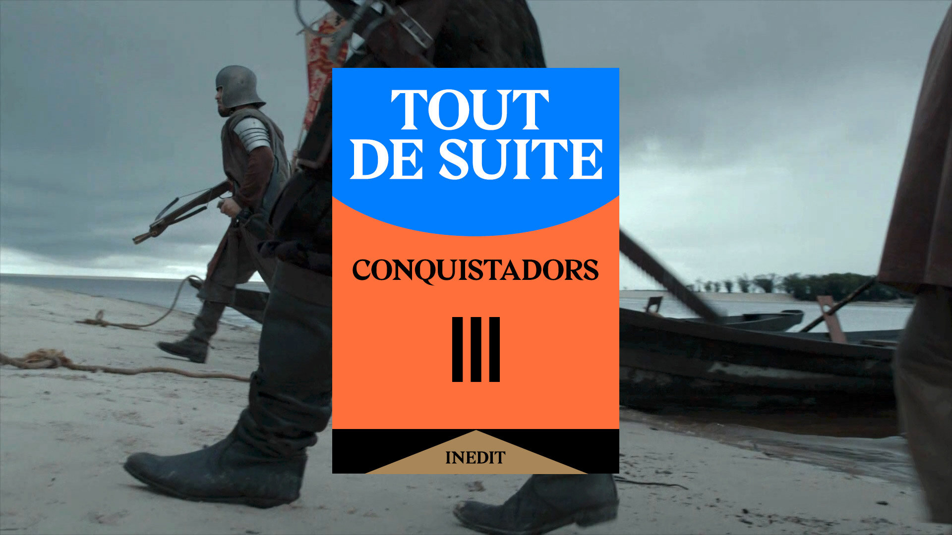
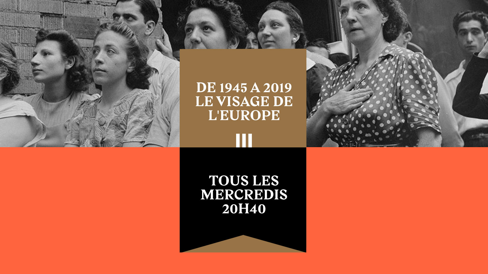
A beautiful serif typeface and vibrant colour combinations. Roman arch shapes and modern layouts. Footage arranged in diptychs and triptychs.
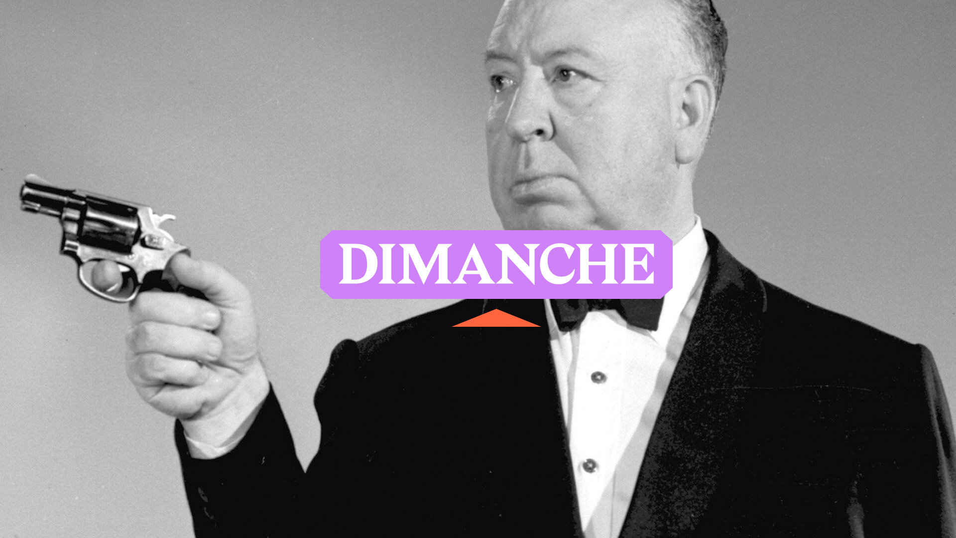
Classic imagery, but cropped, edited and remixed for a modern public. A synthesis that borrows from the past but is unmistakably current and modern.
Ushuaïa TV
Rebrand Pitch
📍 France
Chemins — Paths
Paths are ways to connect.
They link people, places, cultures.
They broaden your horizons.
They are an invitation to explore.
To move and to be moved.
Paths are everywhere: from ants pheromone trails to elephant tracks, from whales migratory routes to river streams, from mountain passes to interstate highways. In the nerves of leaves, in our veins and arteries, ingrained in our brains.
Paths are our way to escape from all the artificial things that surround us everyday and into a more natural, authentic, unspoiled world.
Embracing the bright, vibrant orange colour of the logo,
this is an identity that is joyful and radiant.
Reducing the path to its essence, through a visual representation that condenses the complexities of the real world into a simpler form, we emphasize its connection values. Instead of trying to blend with the images, it provides contrast, highlighting and elevating the content.
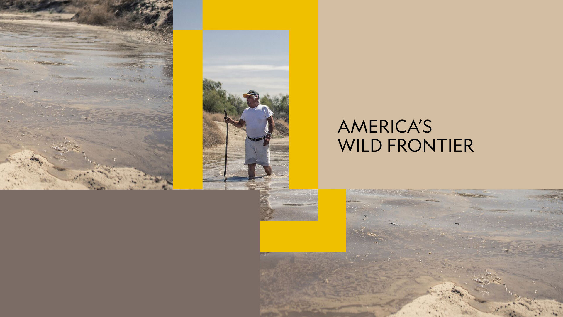
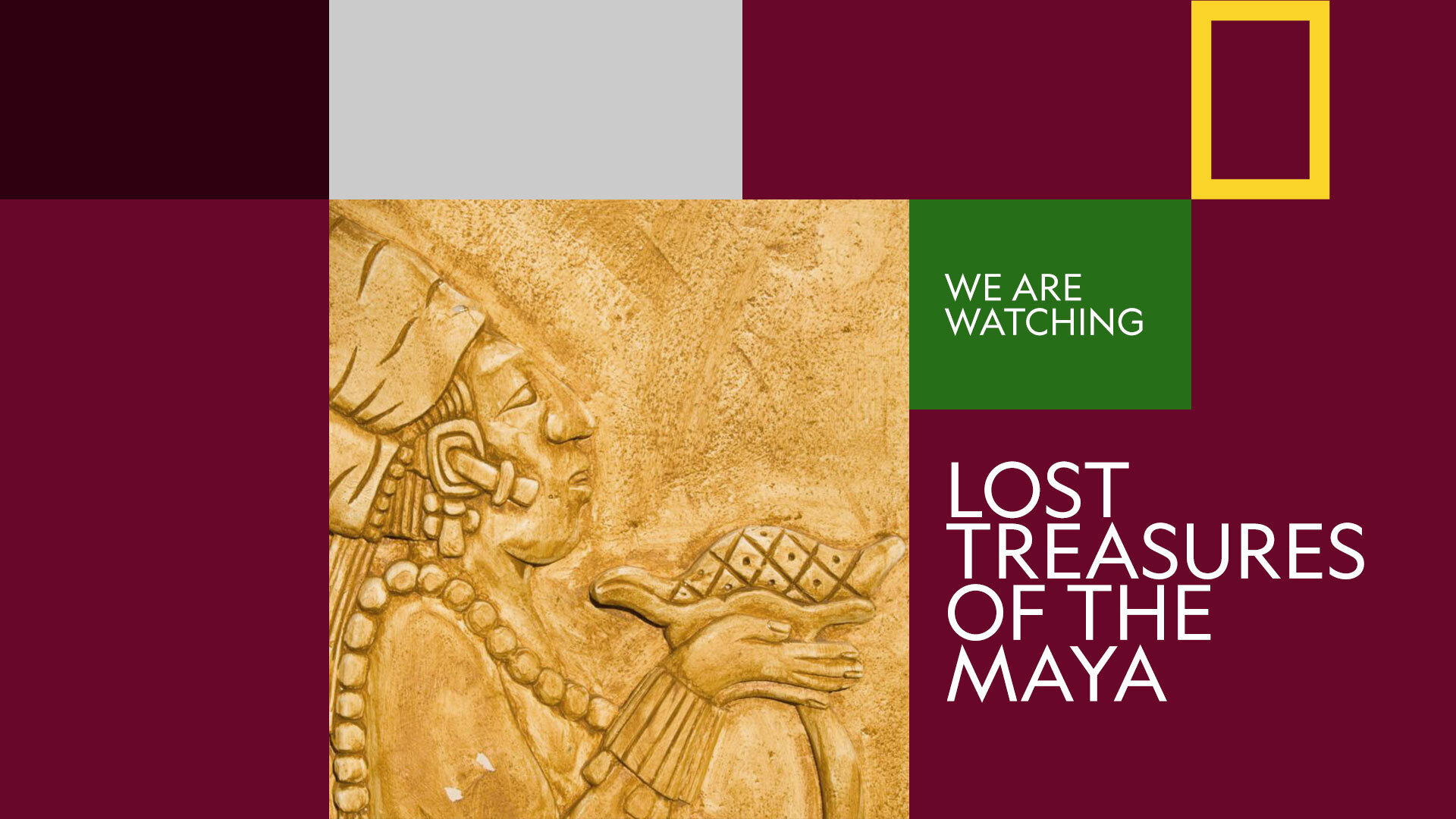
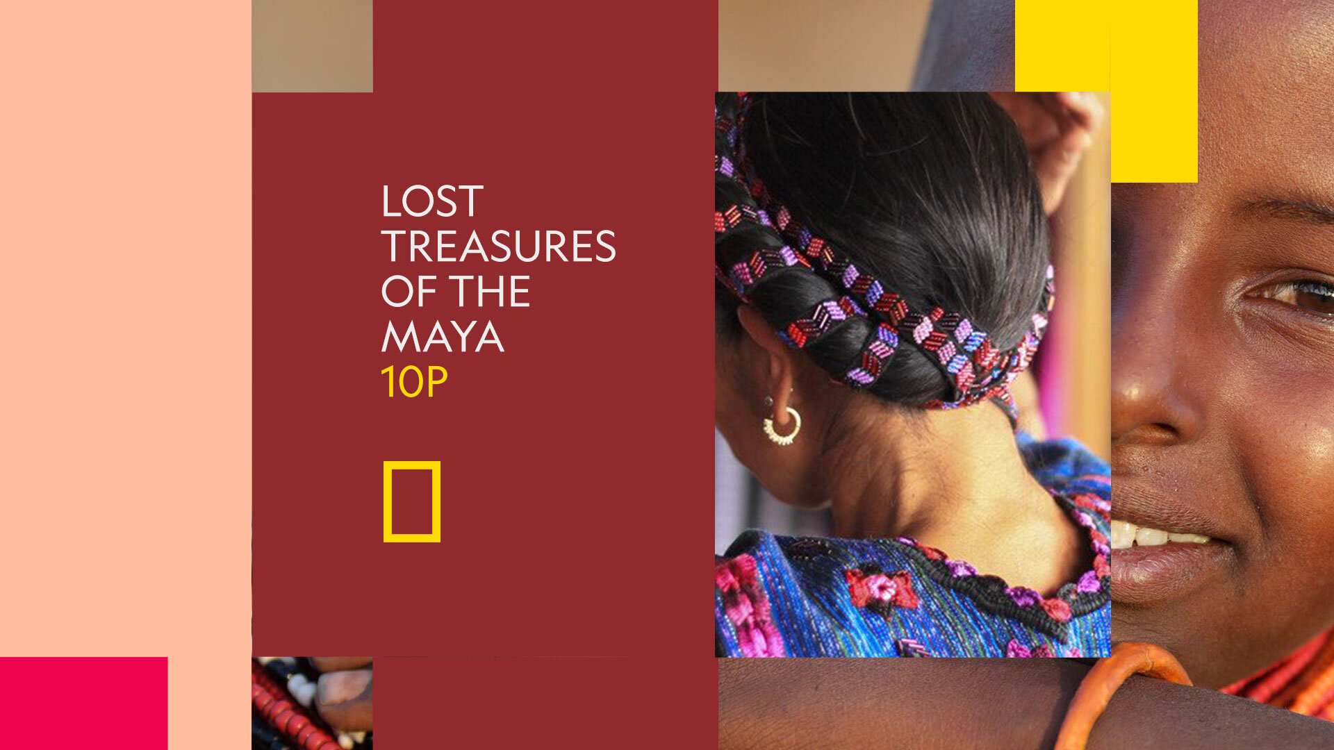
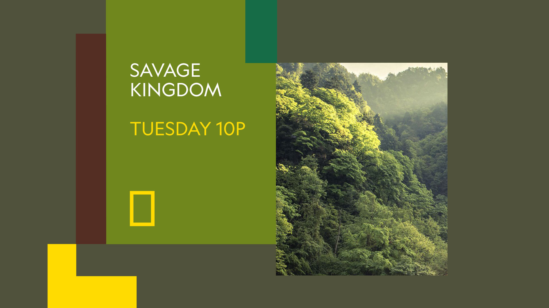
Nat Geo Refresh
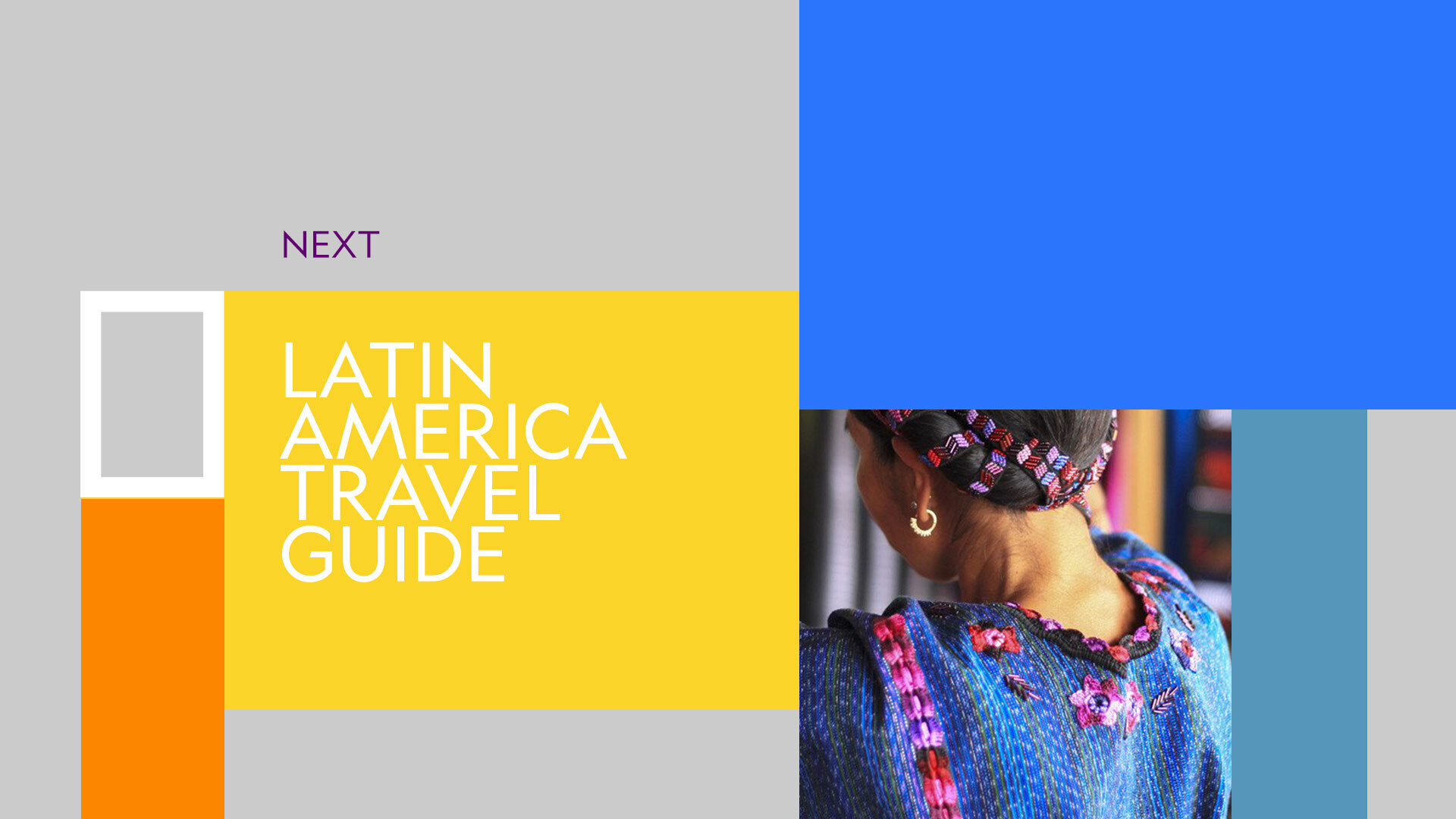
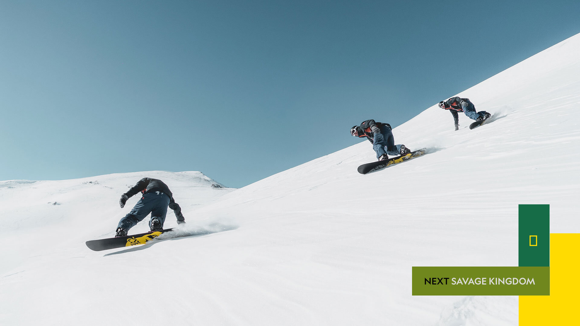
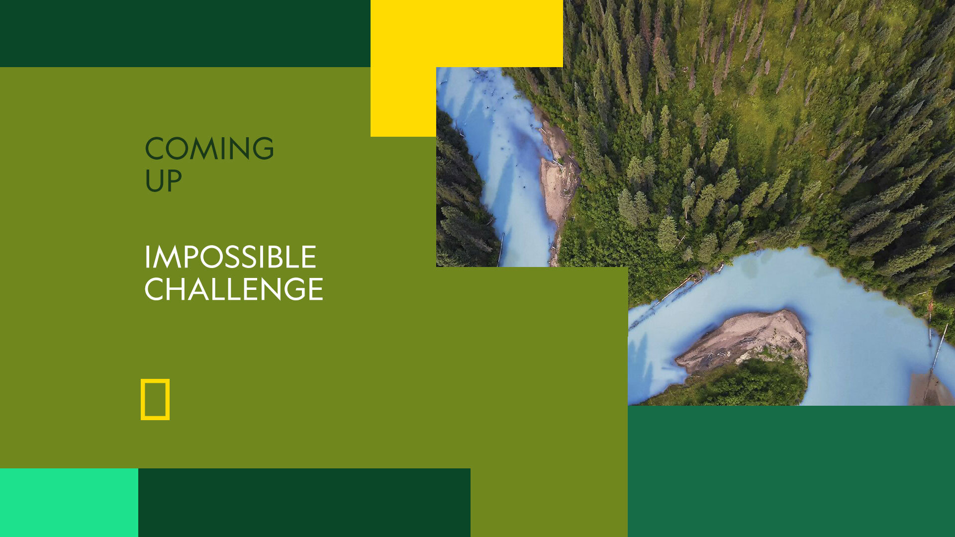
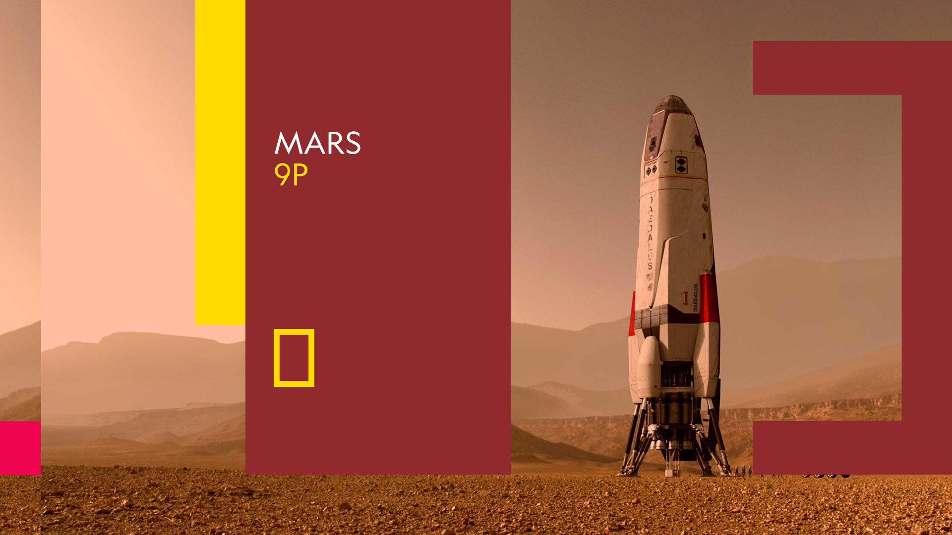
Design exploration
📍 Latin America
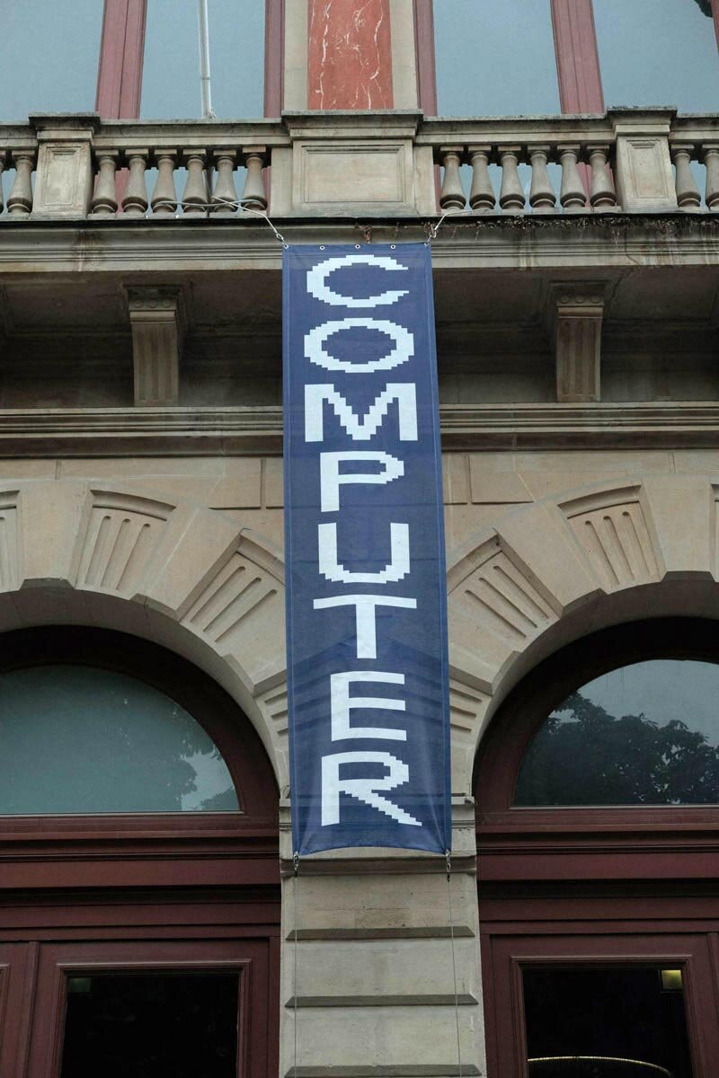
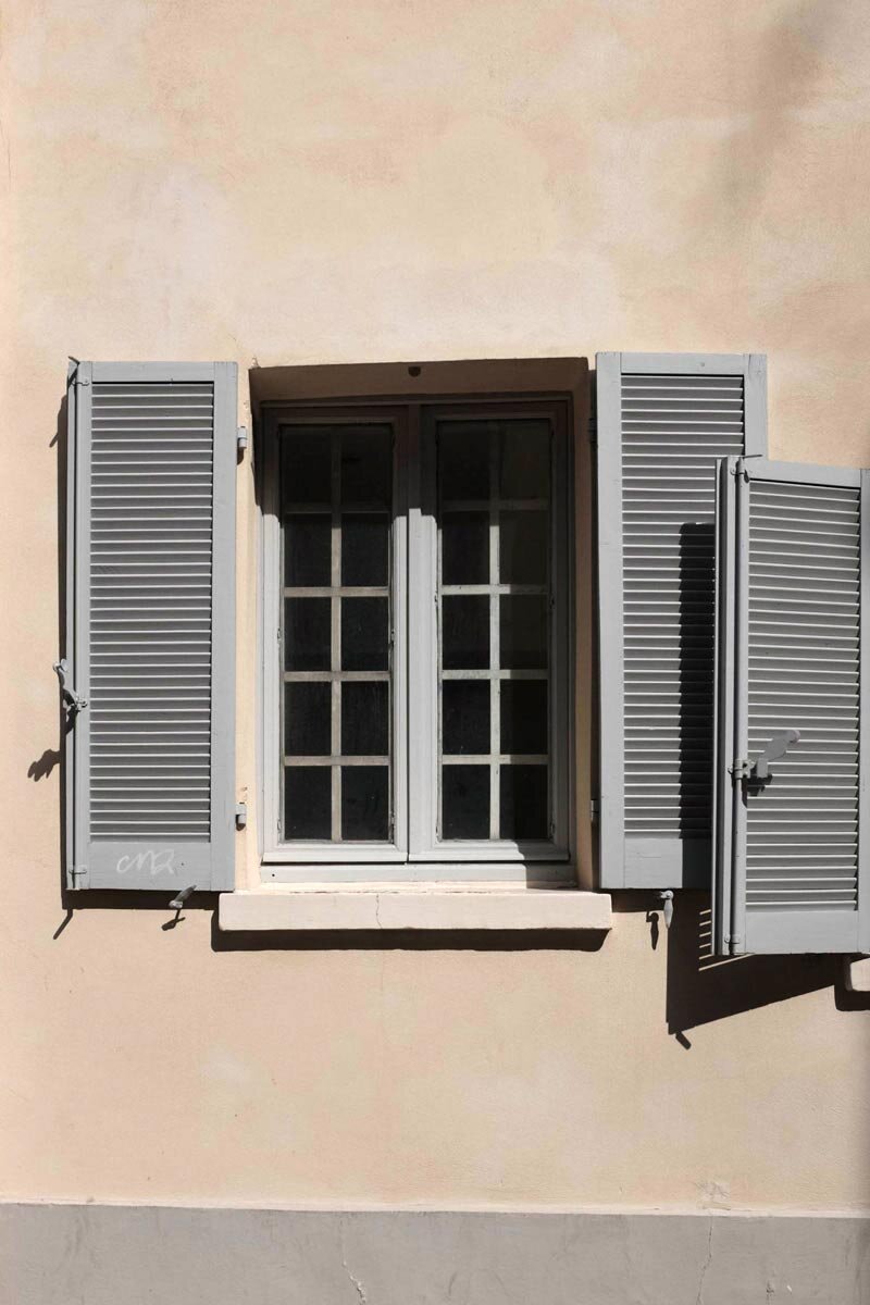
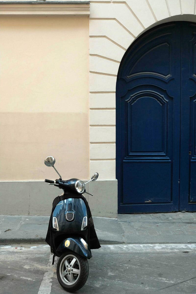
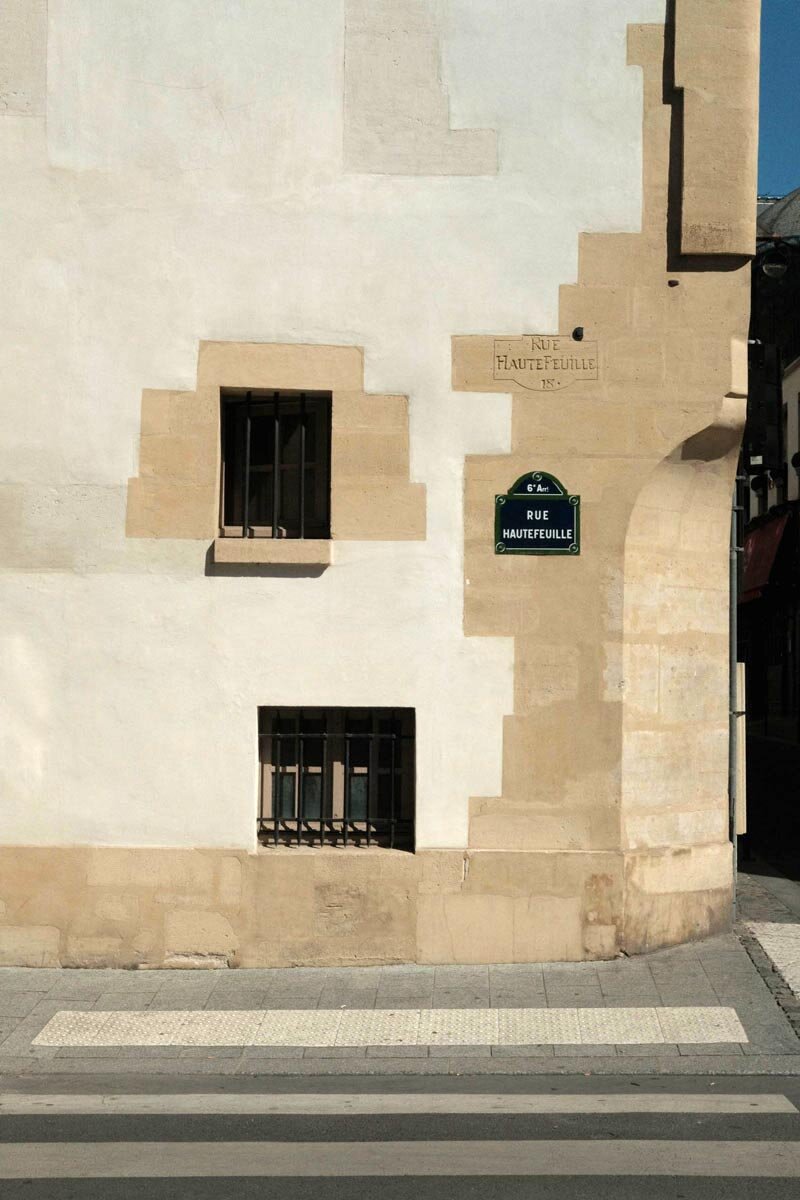
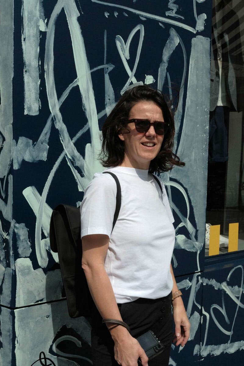
📸 Paris, 2019
ESPN
Rebrand Pitch
📍 Latin America
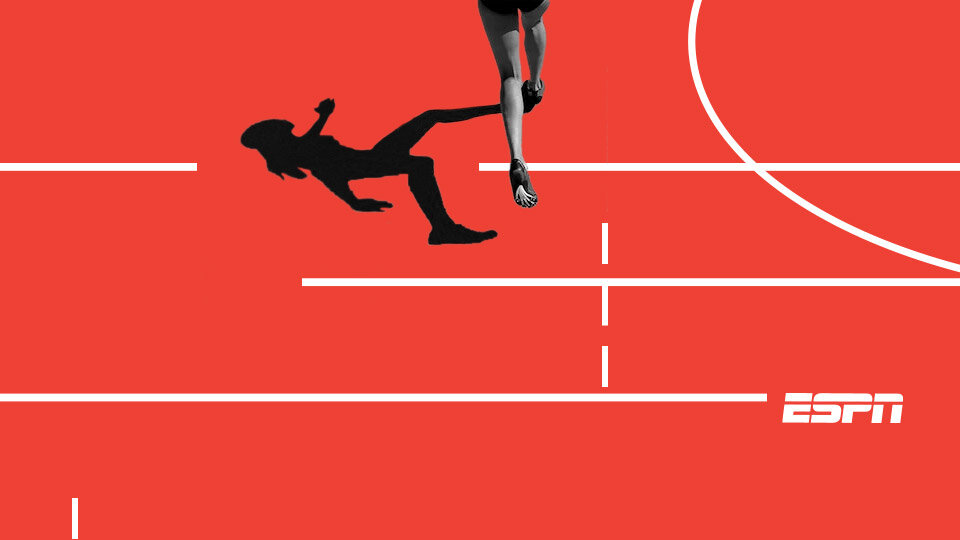
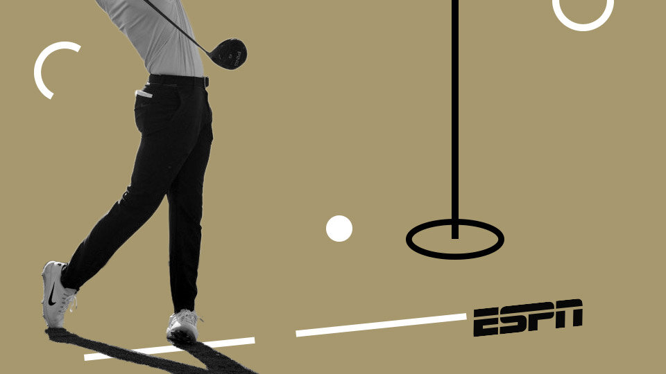
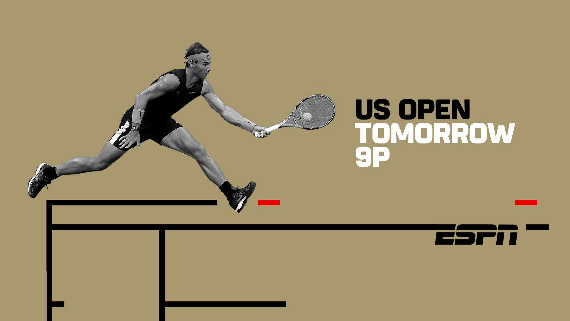
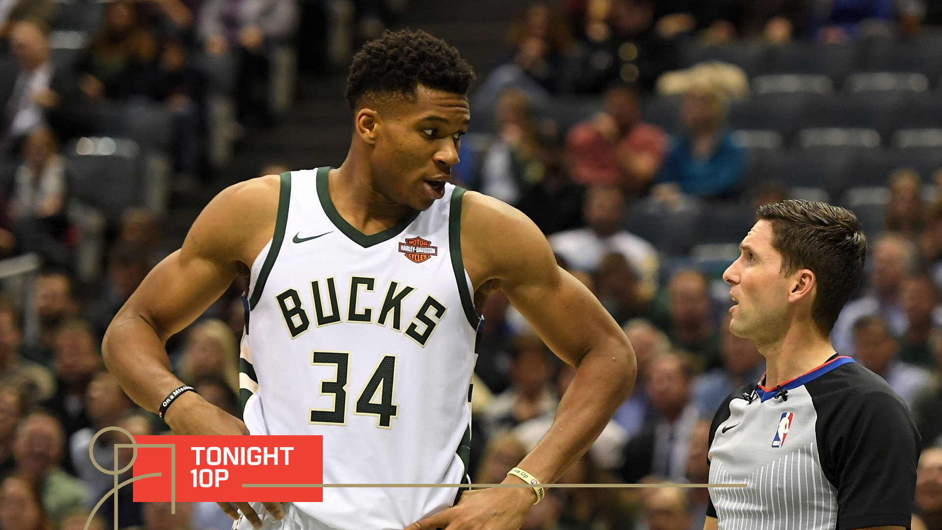
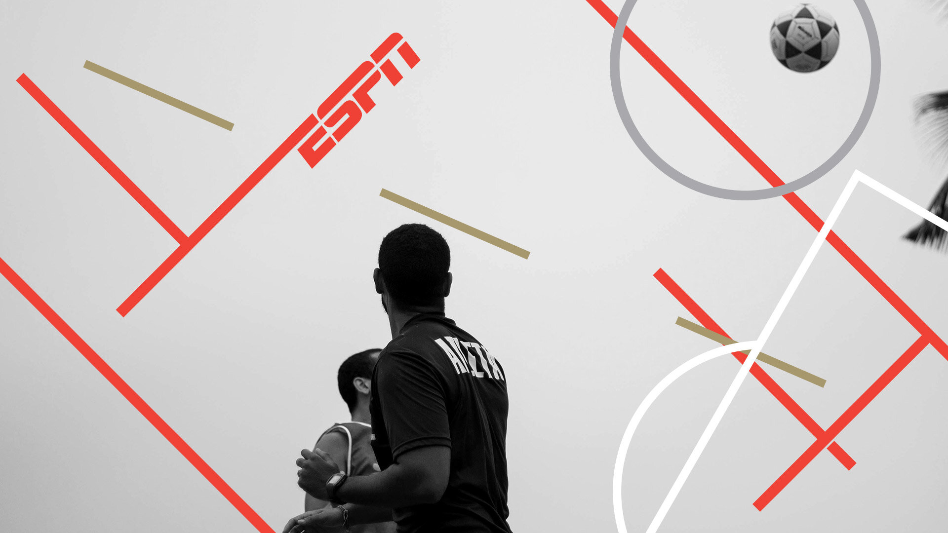
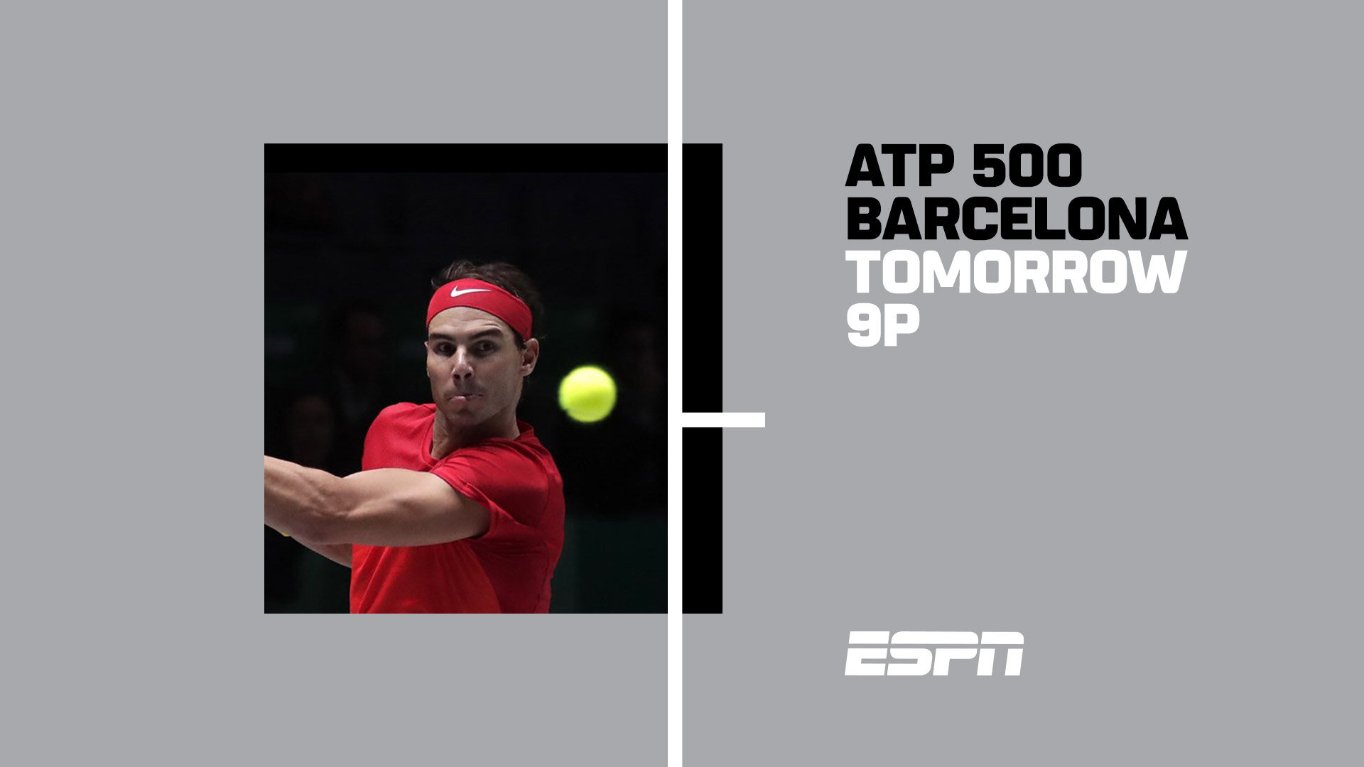
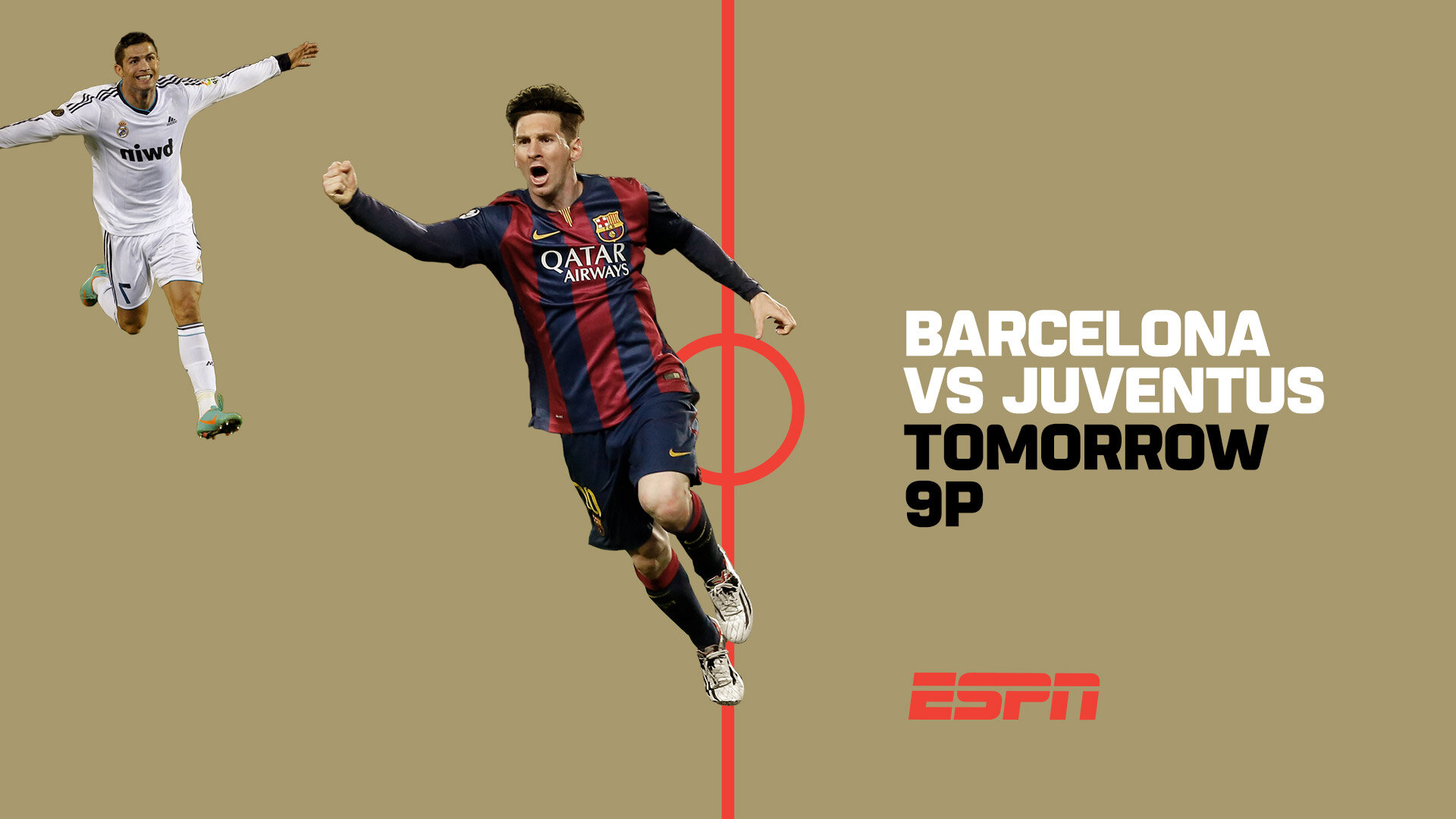
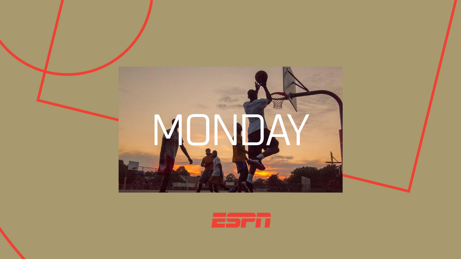
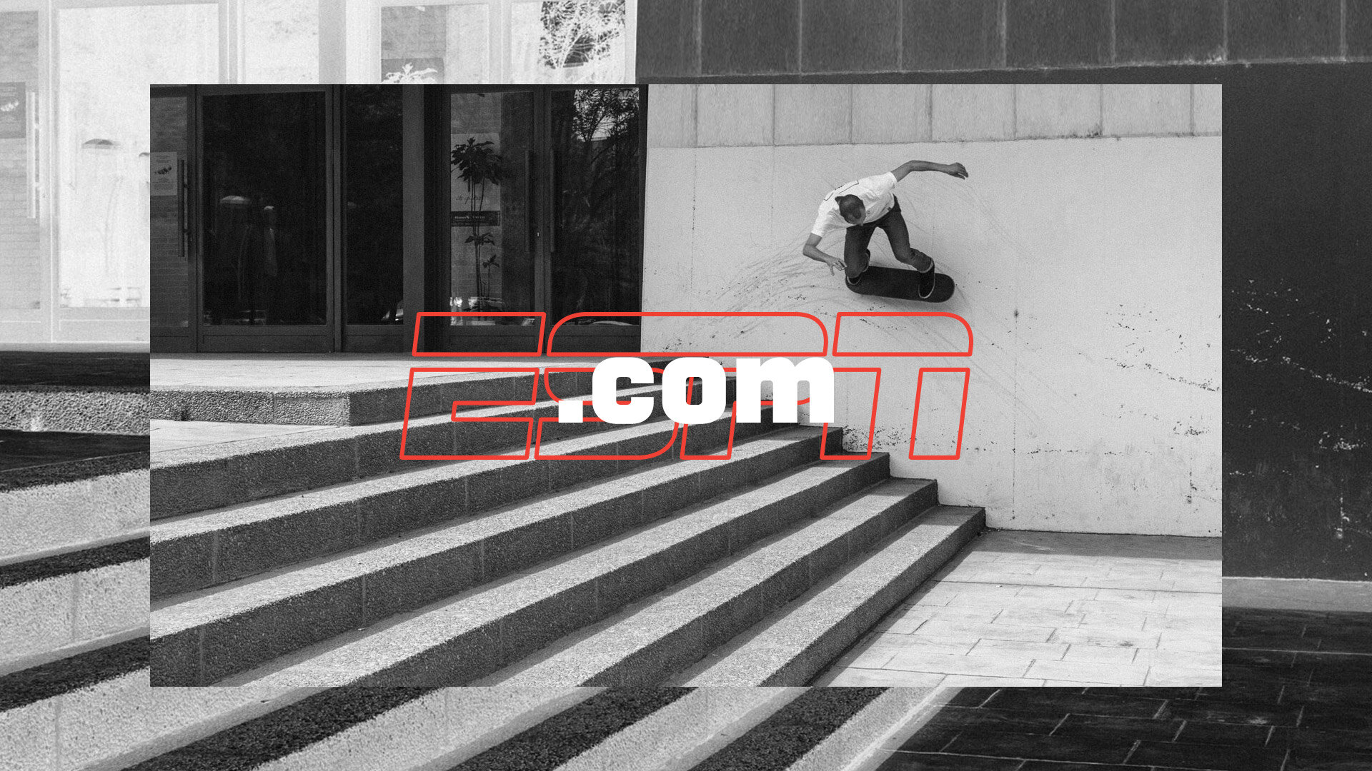
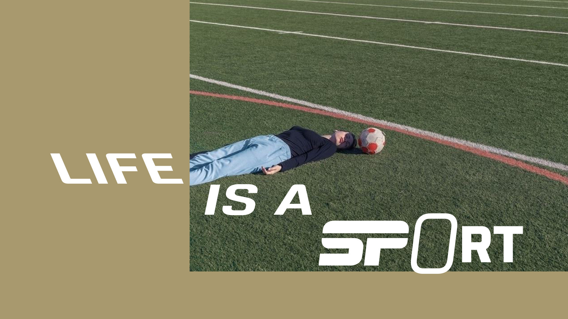
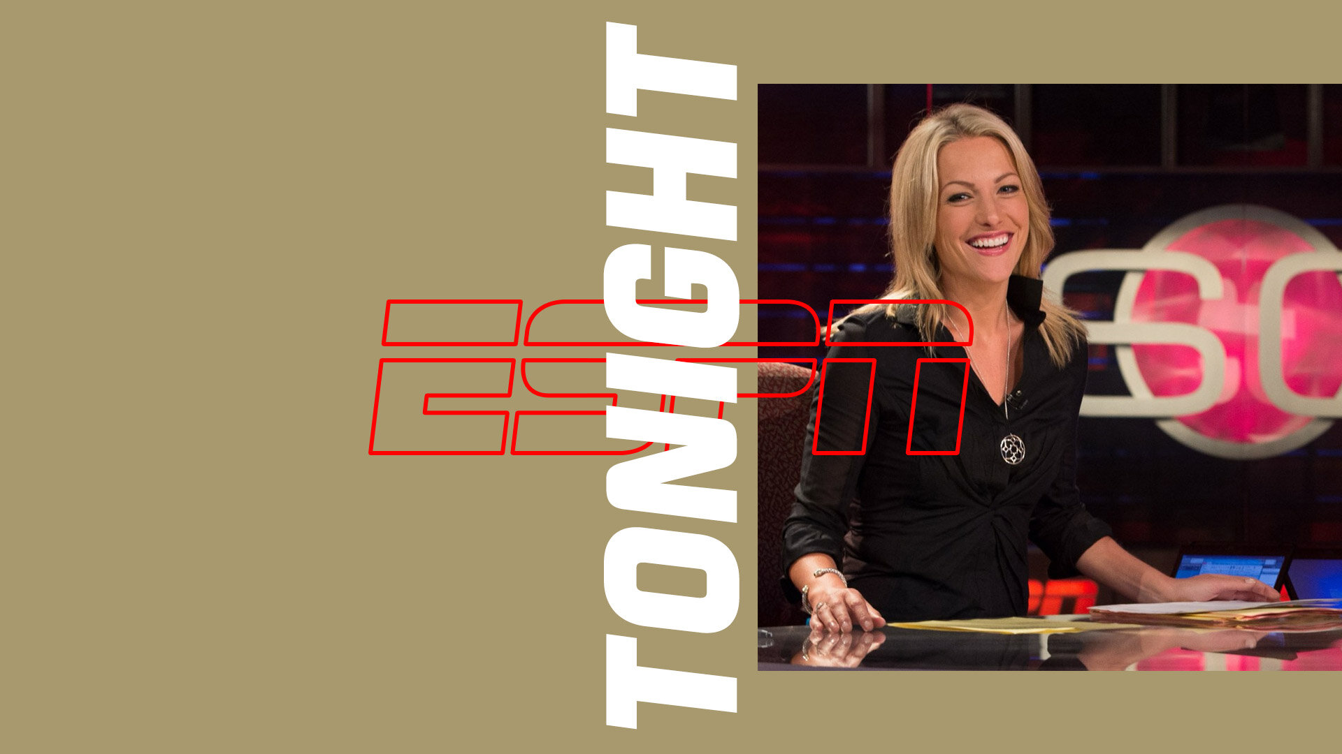
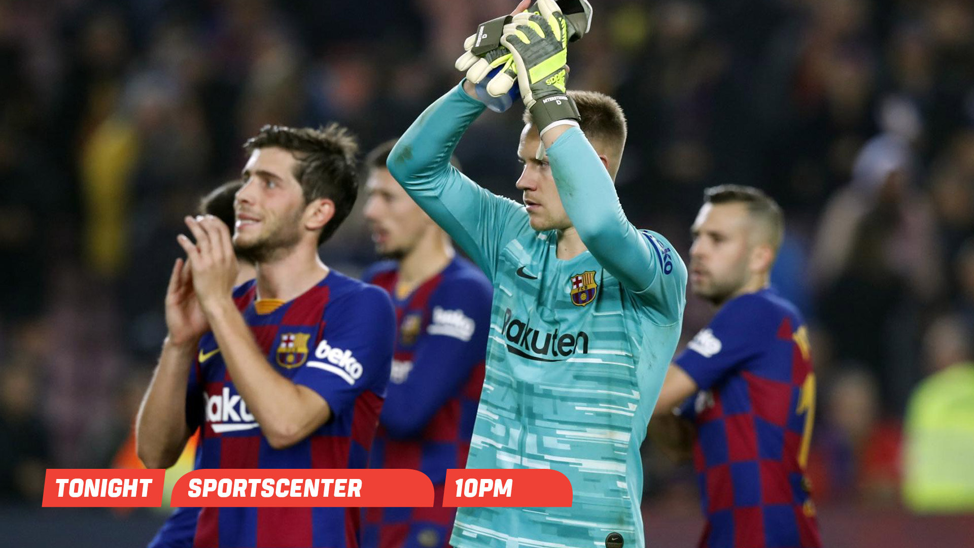
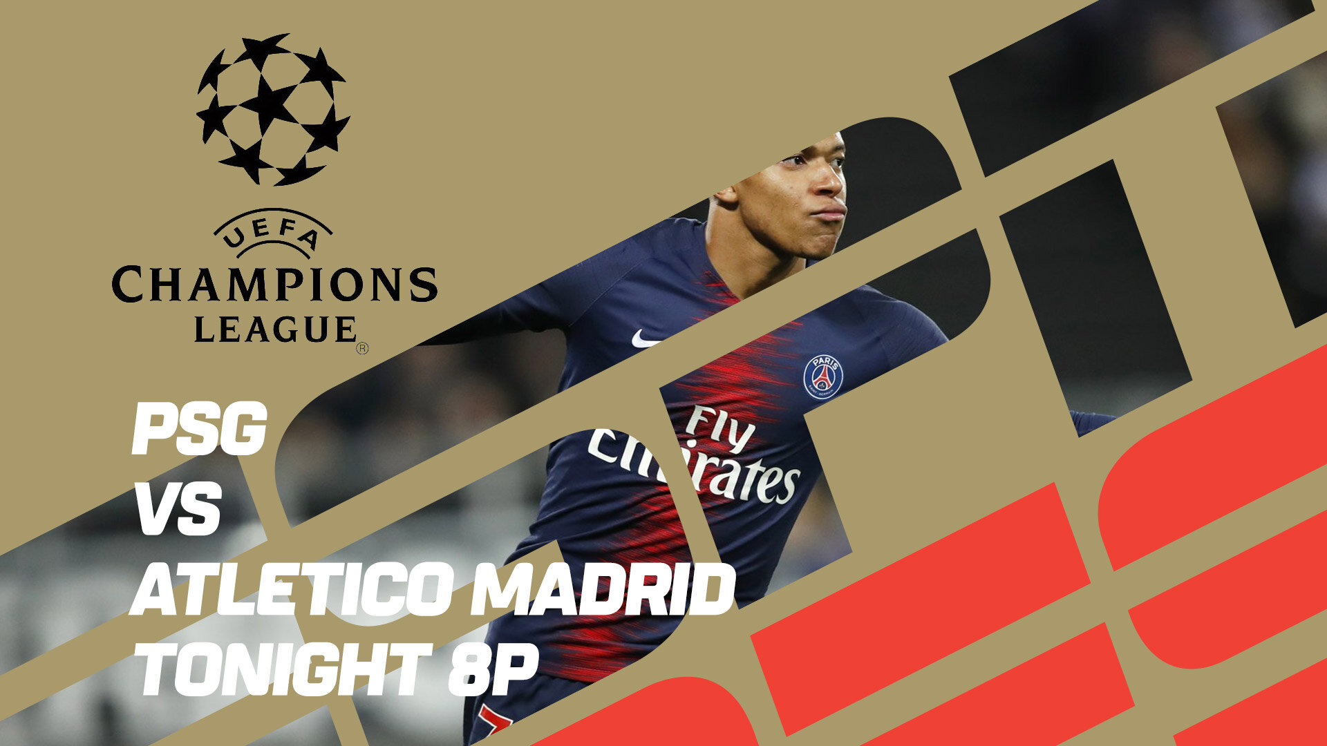
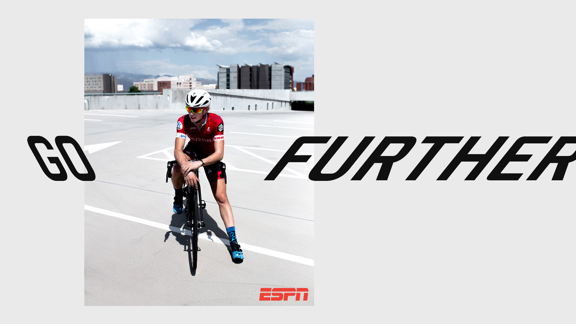
Proposal 1: Speedline to the max
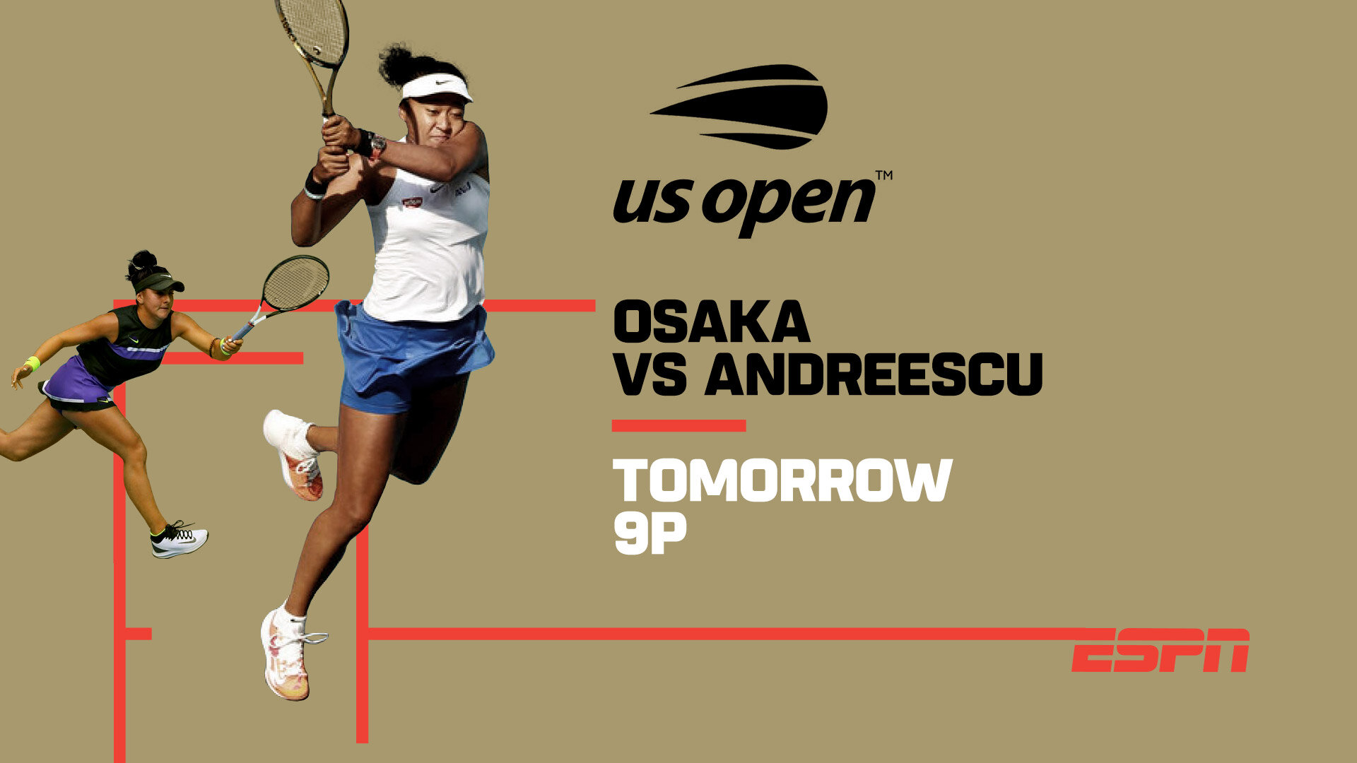
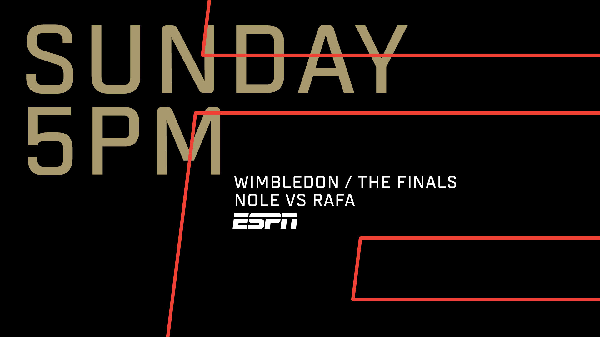
The ESPN logo is iconic. And one of it’s defining characteristics is the "speedline" that intersects it. Lines are also an ever present element in sport. In every sport.
For this proposal, we took the speedline to the max, to build a graphics package that's young, simple and clean, aligned with a world of digital devices and social media.
ESPN
Rebrand Pitch
📍 Latin America
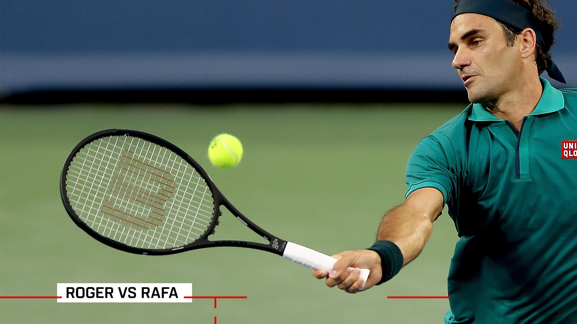
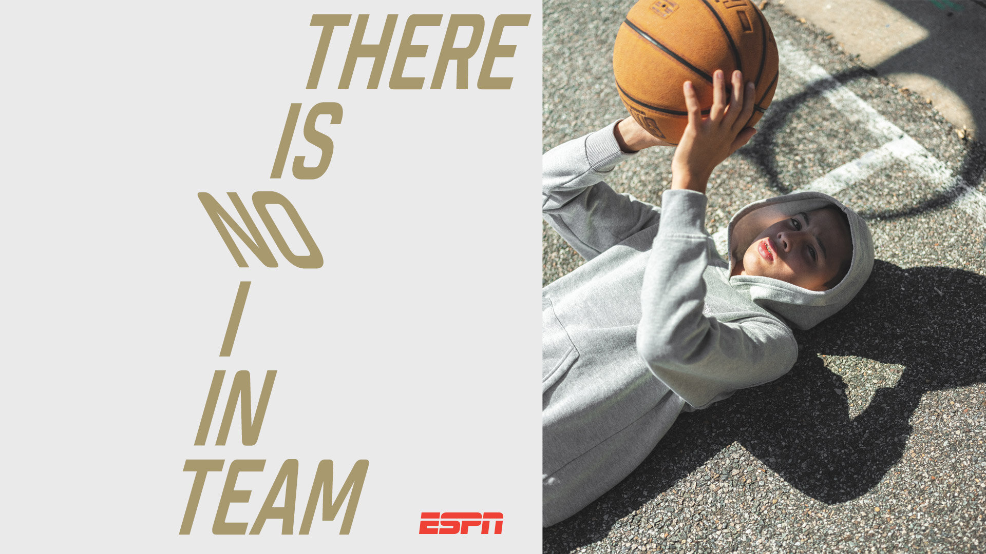
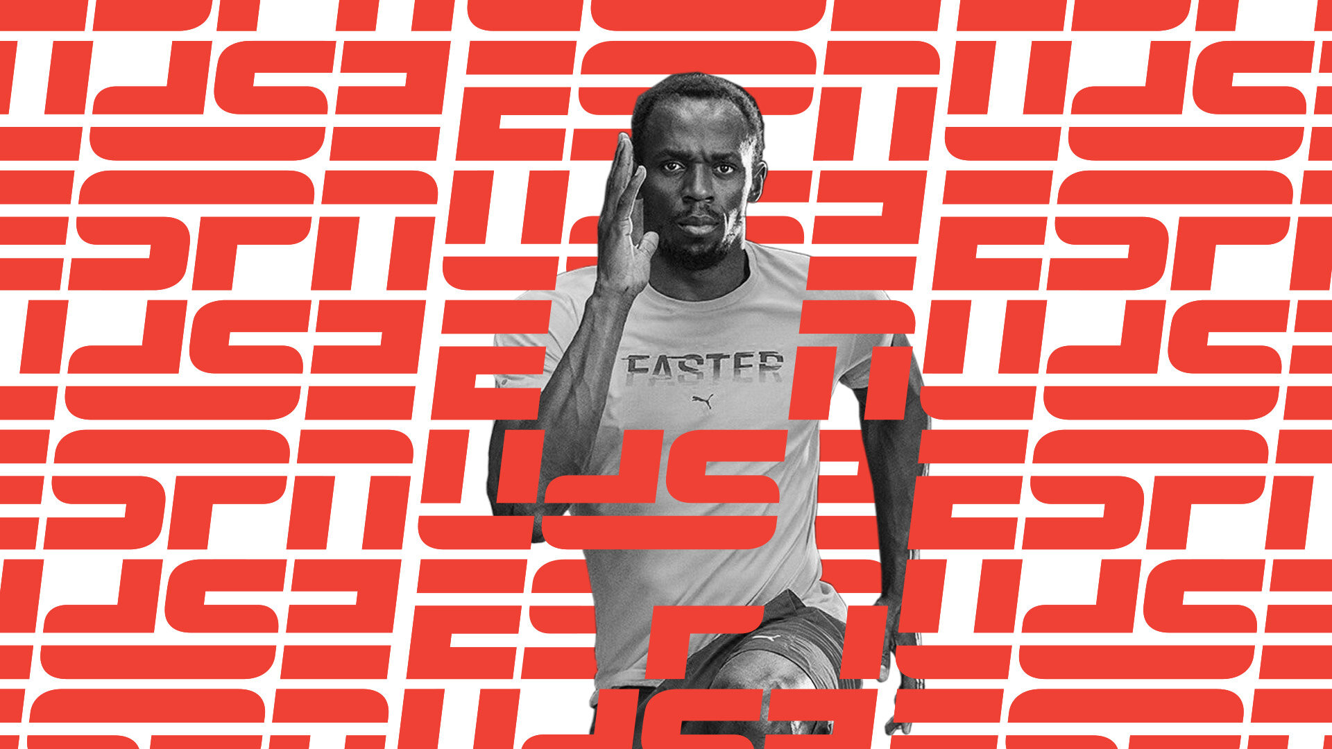
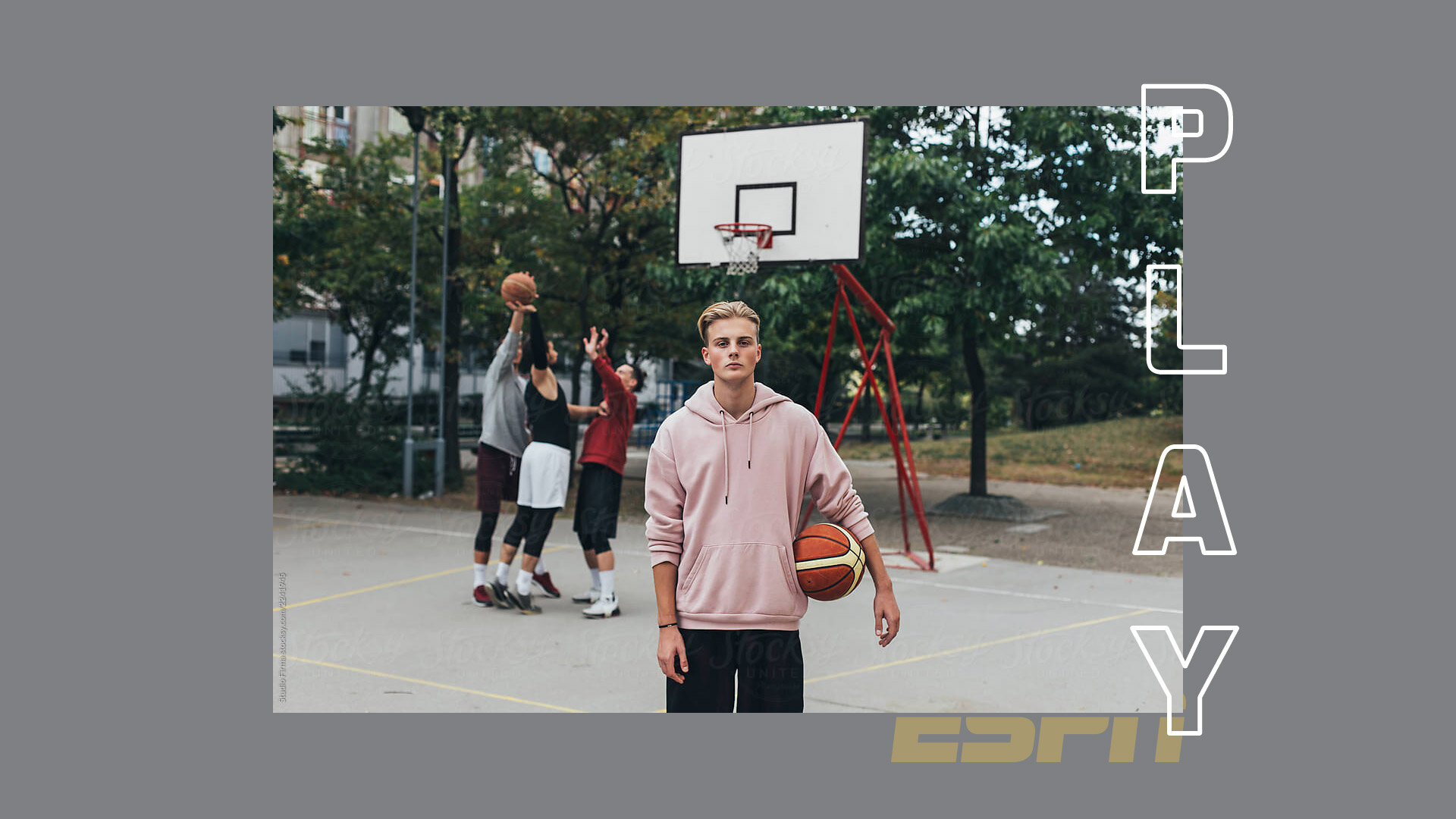
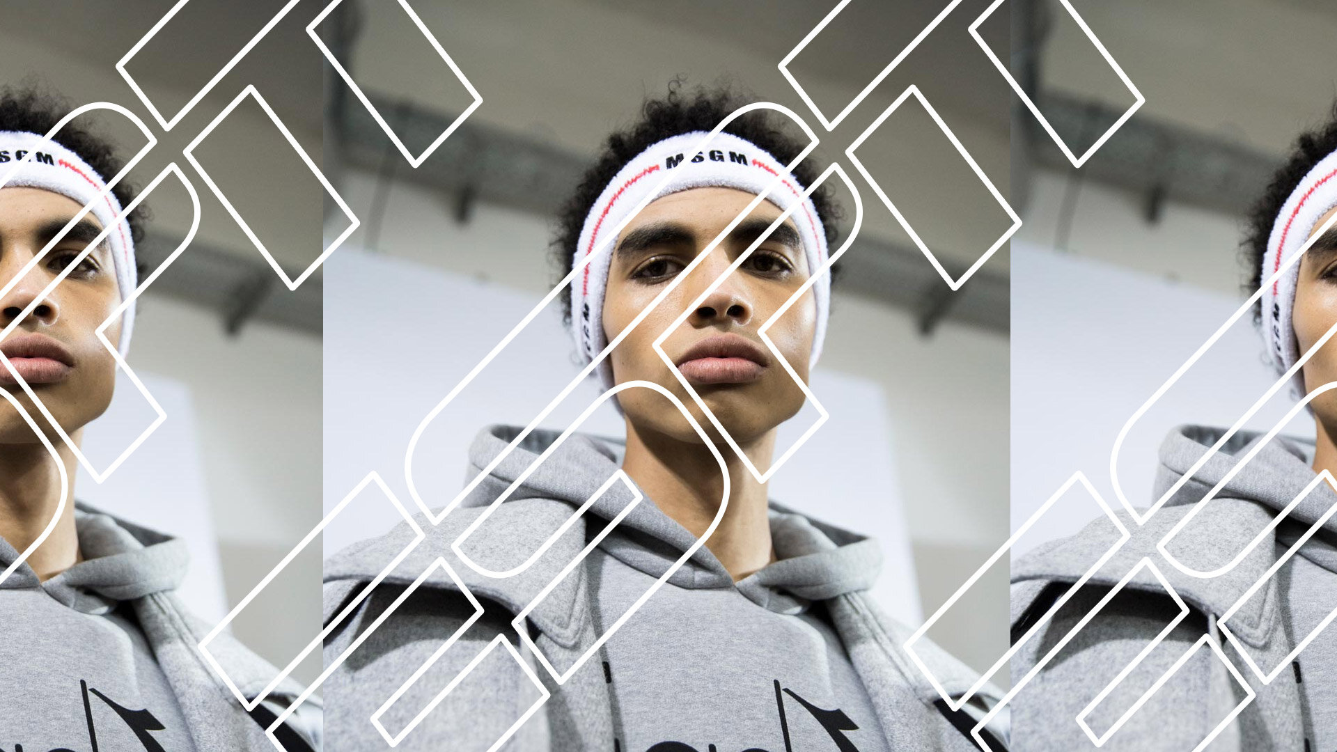
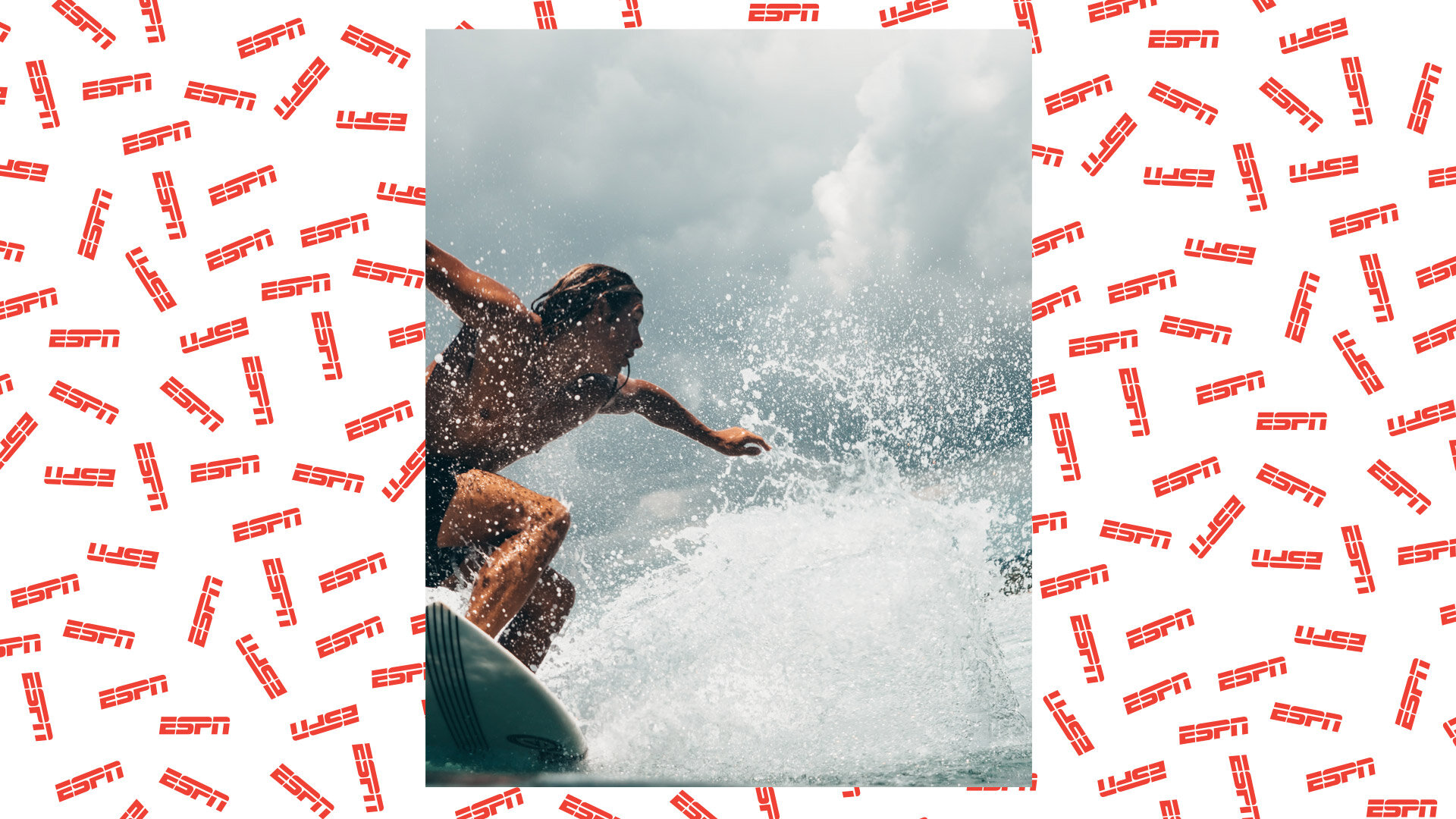
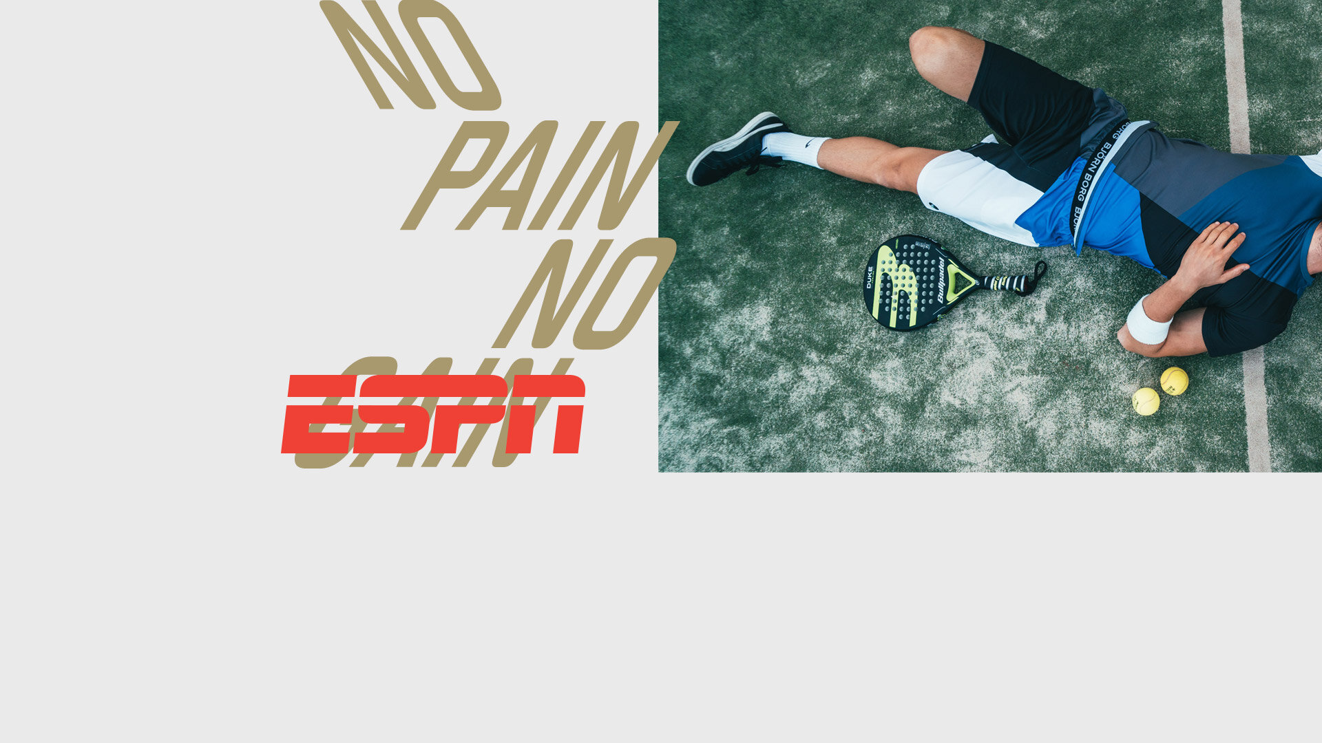
Proposal 2: Team ESPN
We wanted to build a graphic system that intersects sports, sportswear and streetwear. Bold graphics with a strong attitude. Young & rebellious. Something you would wear on a t-shirt. That speaks the language of the new generations. Overlapping classic sports design with edgy and current streetwear trends.
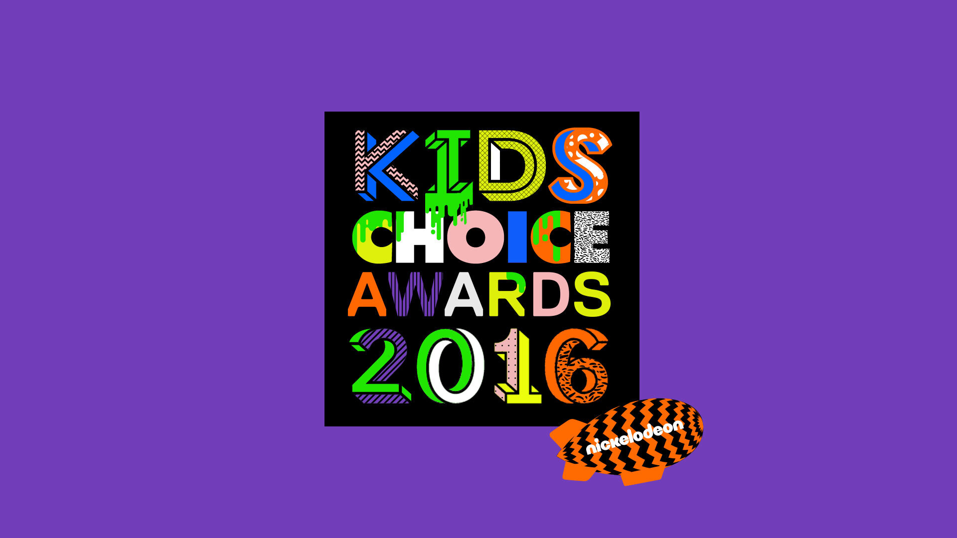
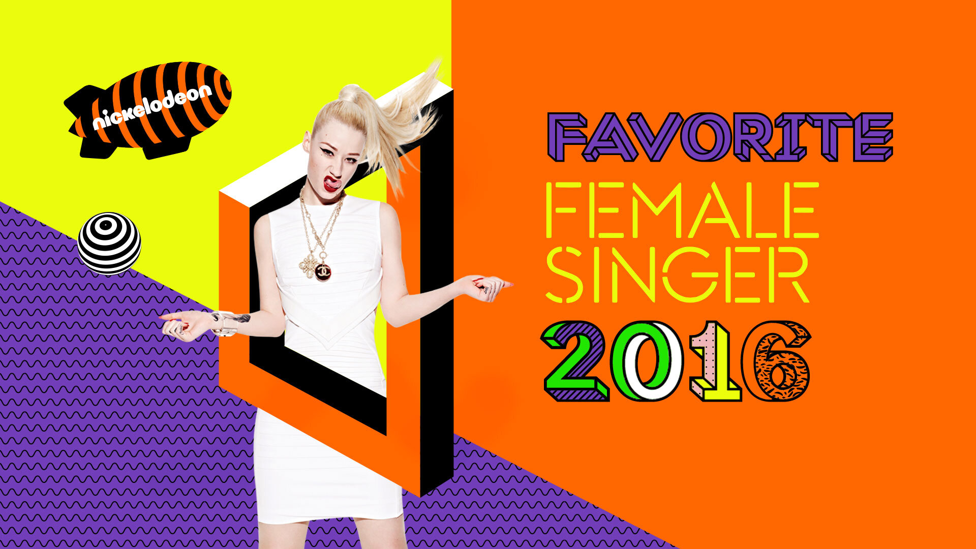
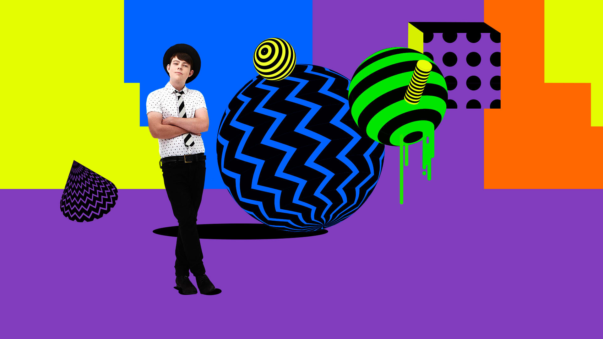
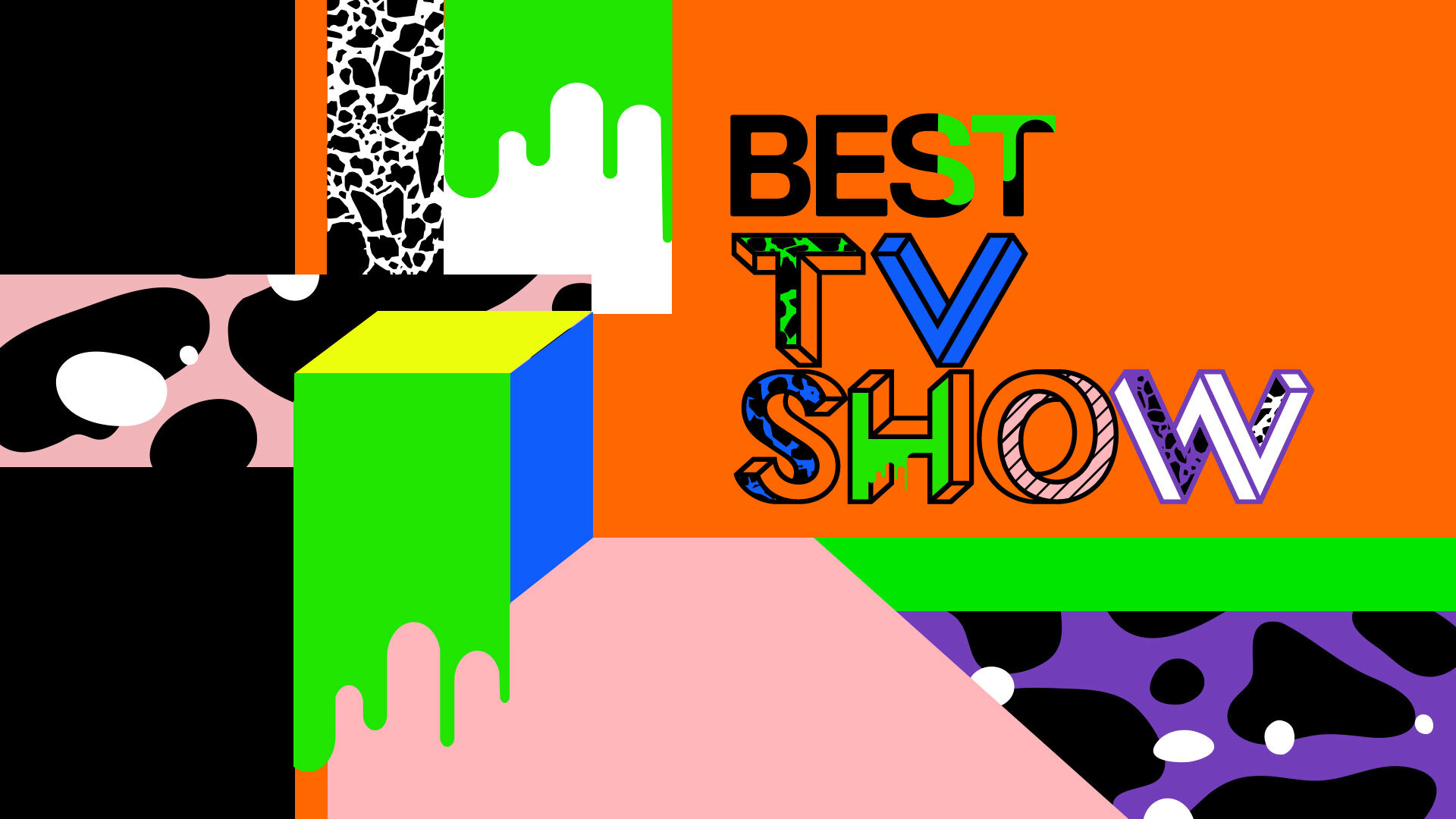
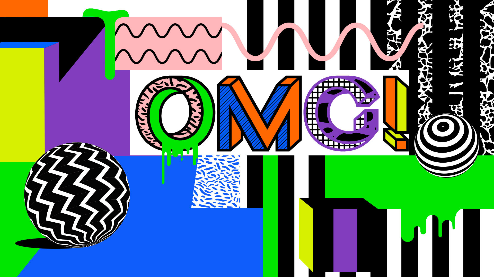
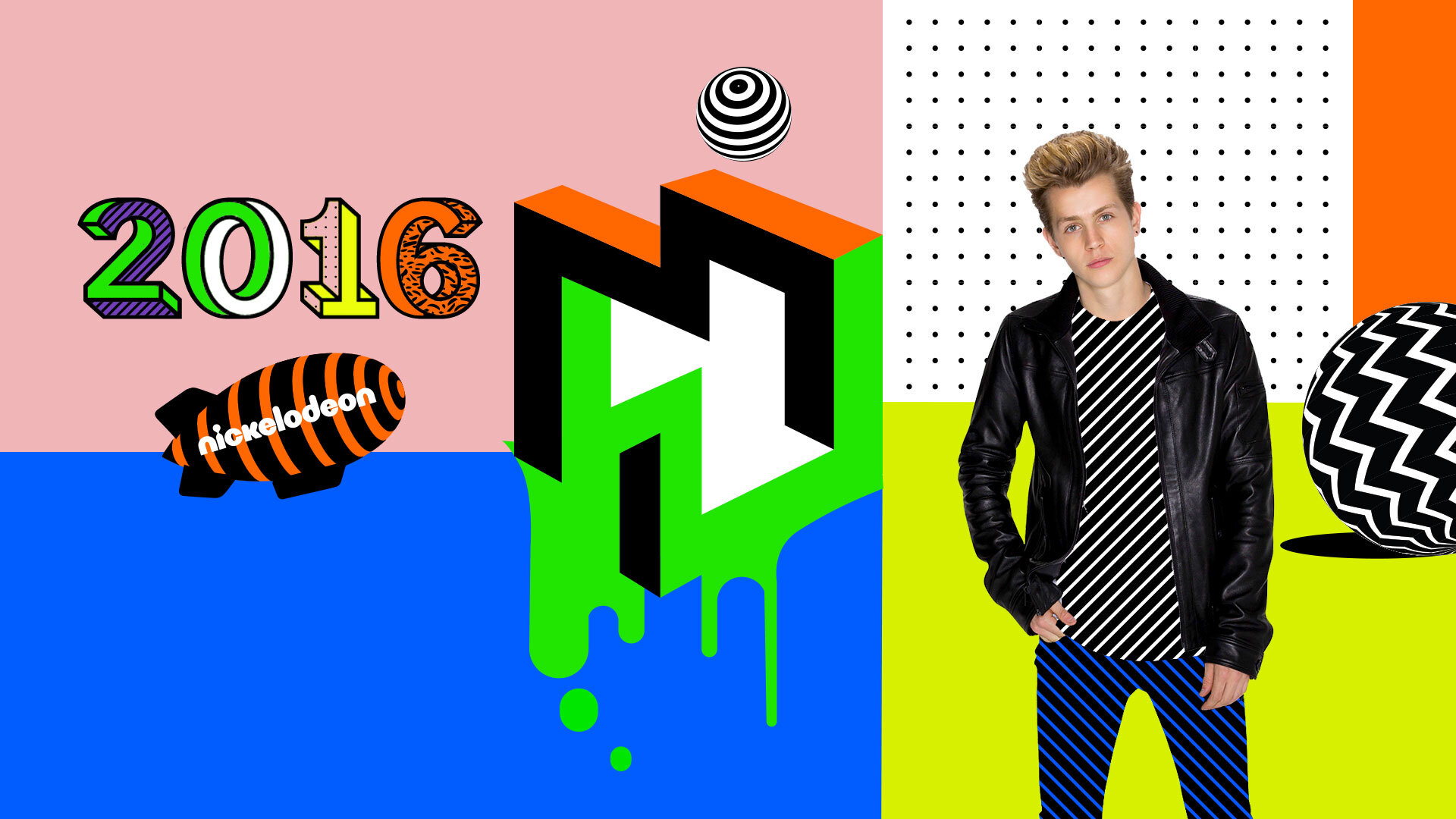
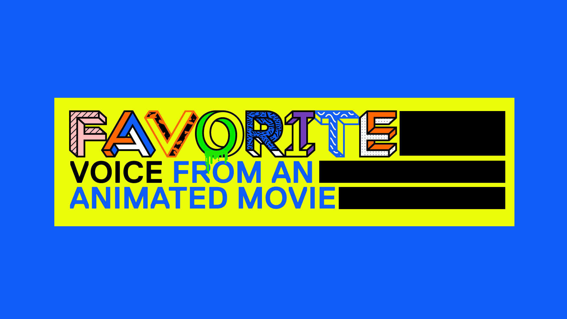
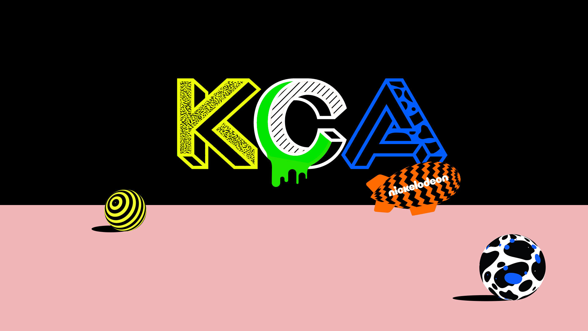
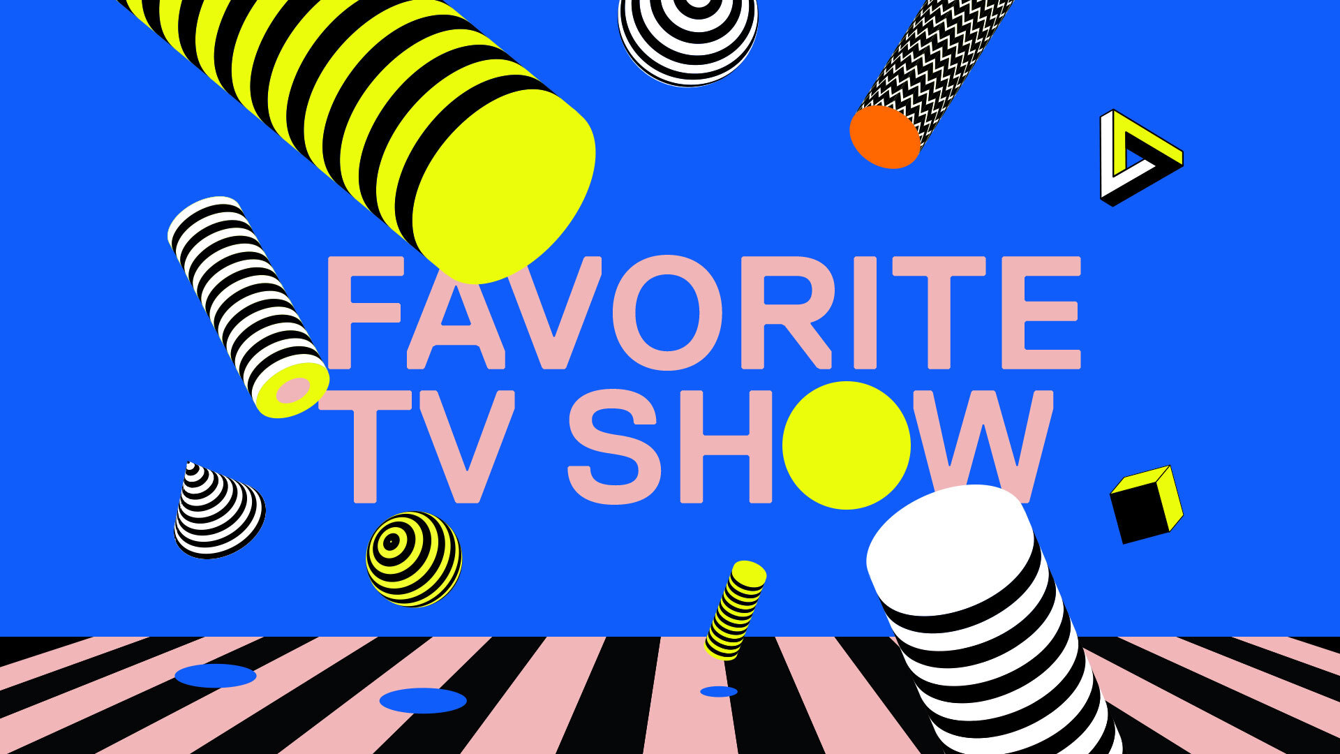
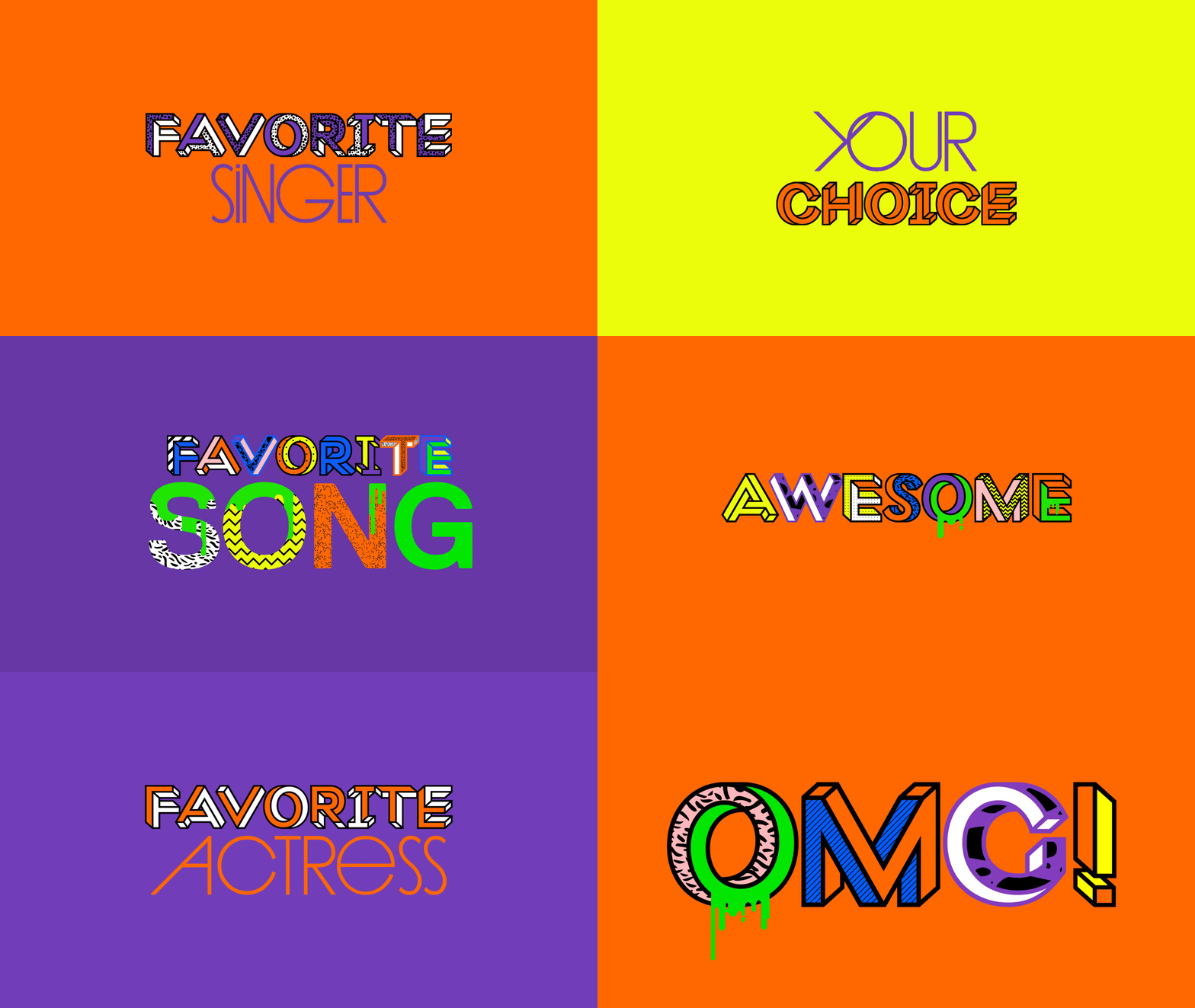
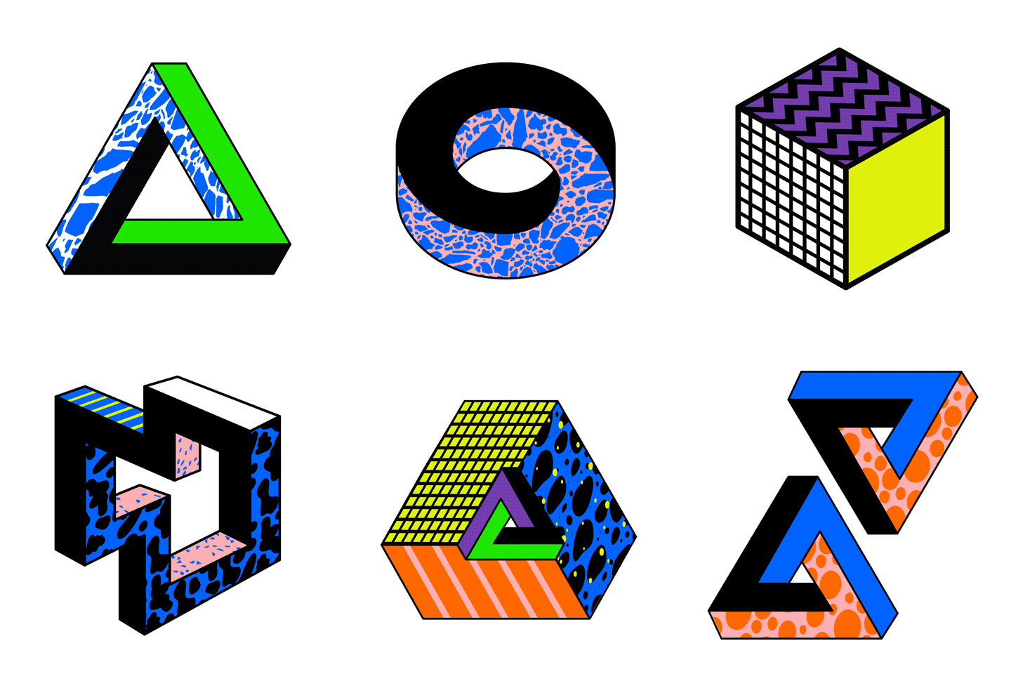
Style Frames for Nickelodeon's Kids Choice Awards 2016 & 2017
Impossible Shapes + Op Art + Patterns + Neon Colors + Slime Slime Slime
📍 USA
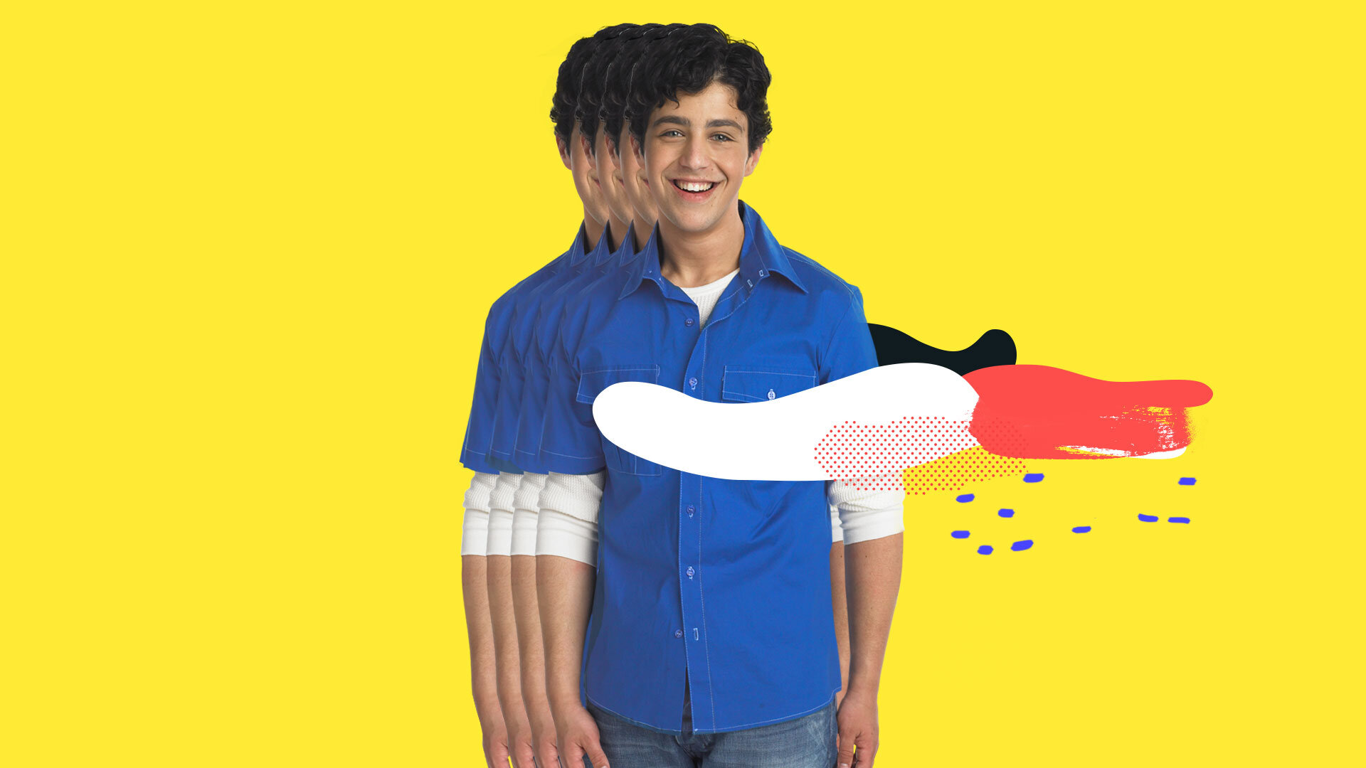
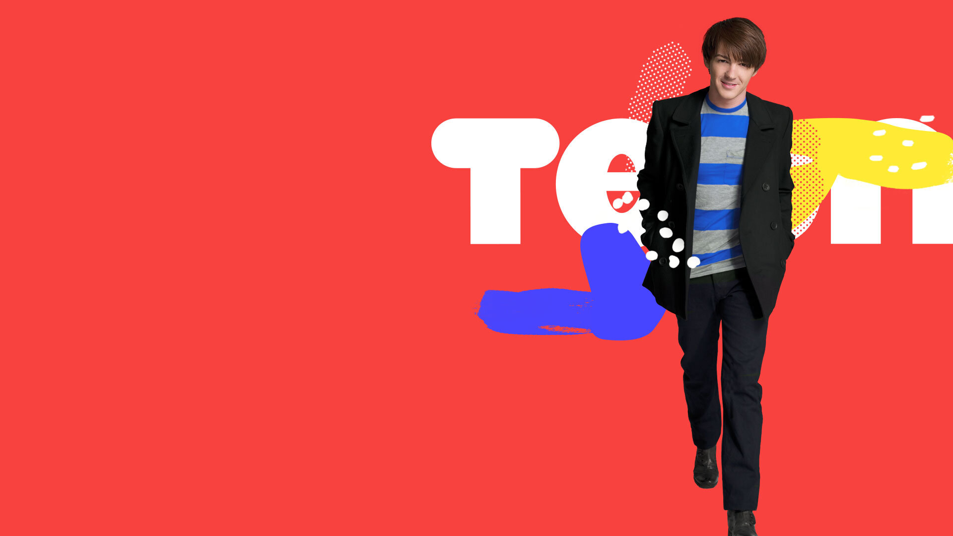
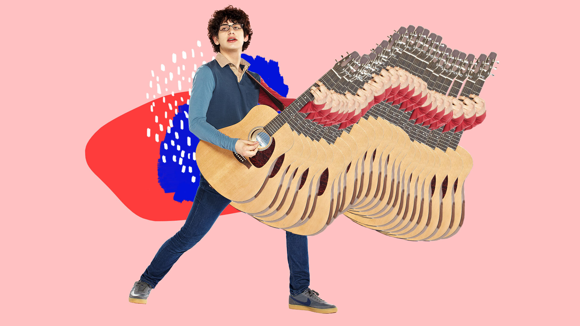
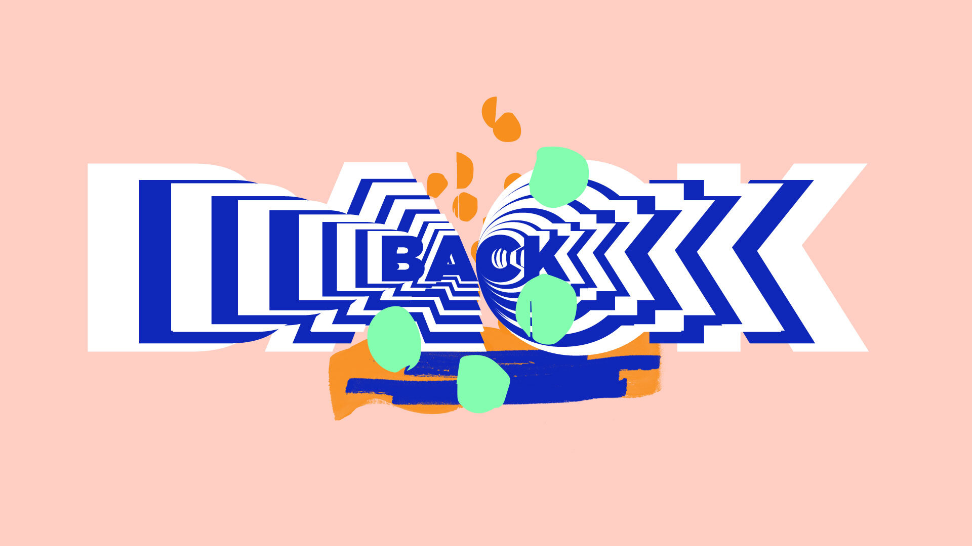
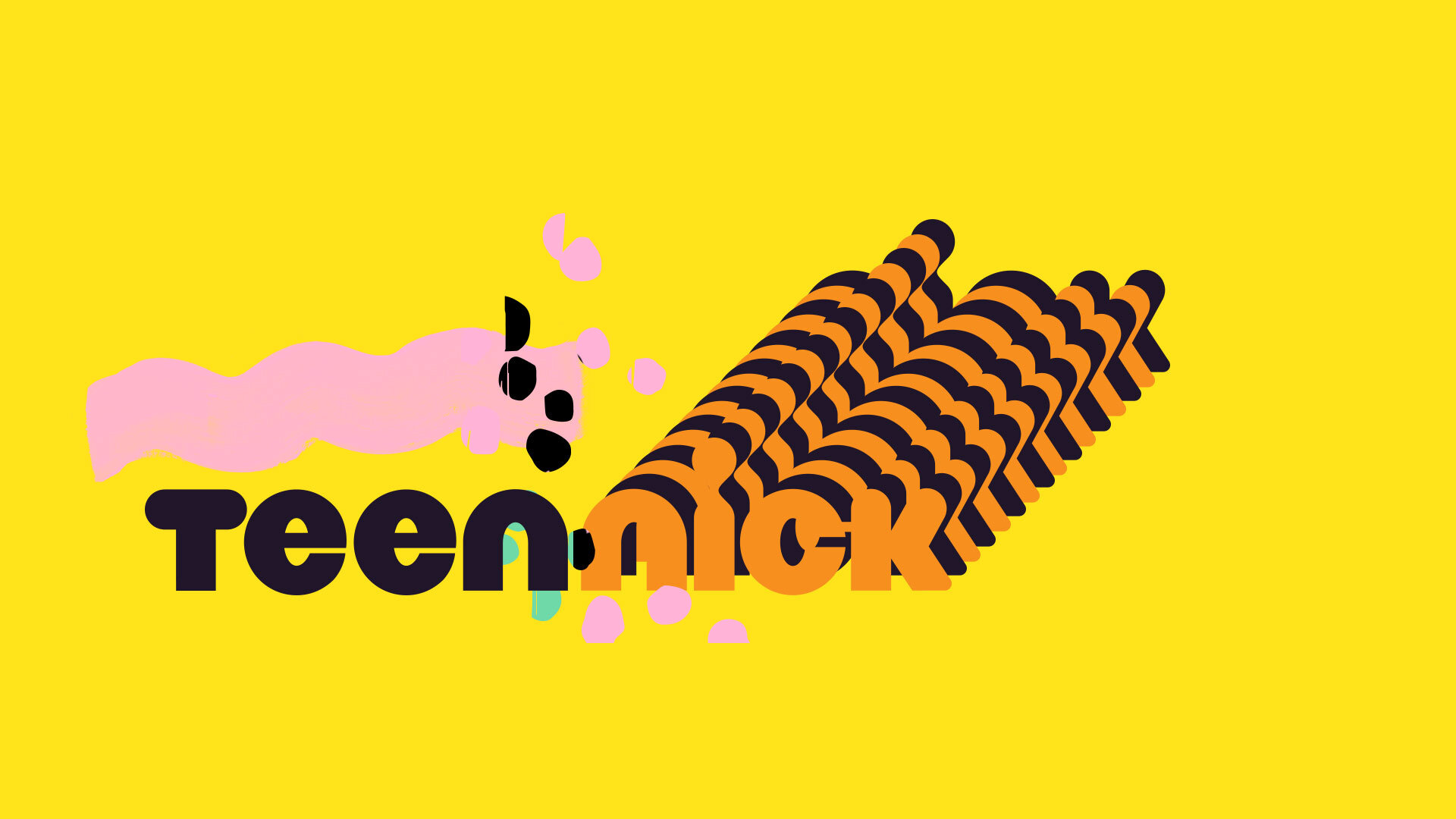
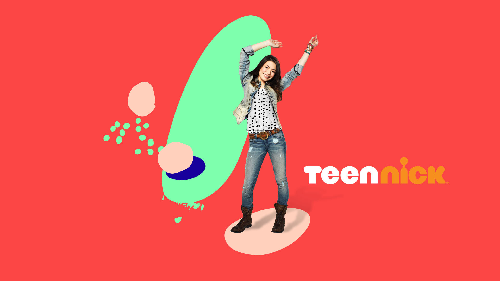
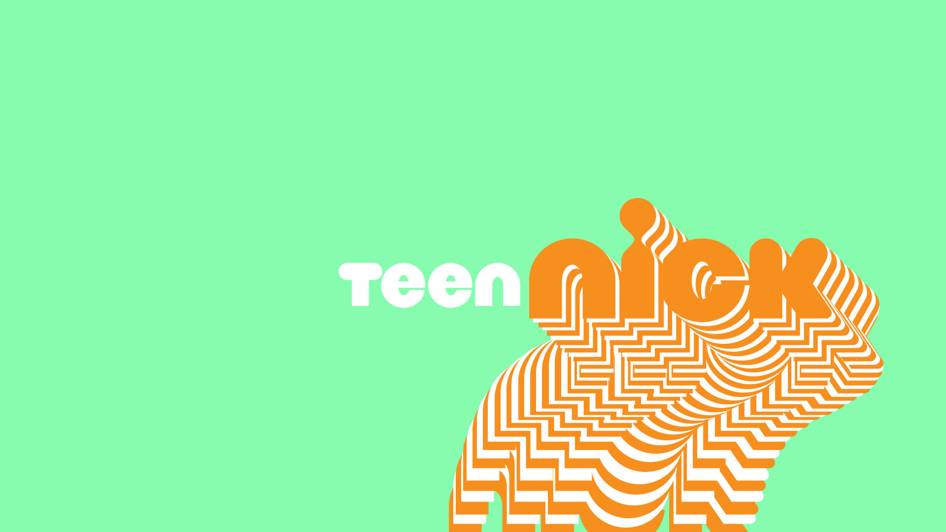
Bumper Designs for Teen Nick
Let's Dance!
📍 USA
The soundtrack of 2020 at ELOISA Studio:


